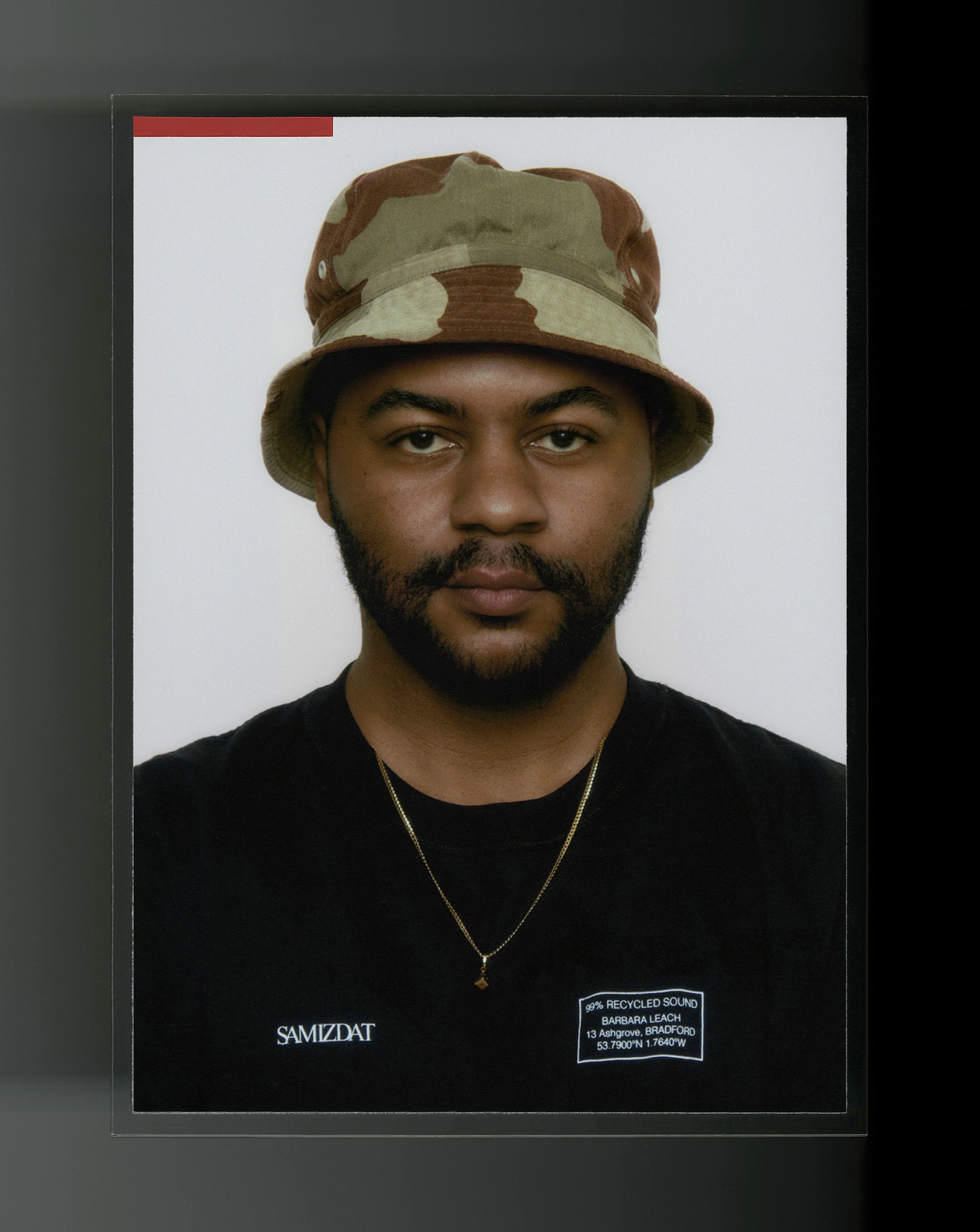
08:00PM
In opposition to culture’s obsession with speed—Rahim’s output remains guarded, incubating as long as necessary while he builds collages that draw out subversive, torqued images. Hassan peels back the layers of his work to share the sources, experiences, and B-sides that shaped him.
NR
Growing up in Los Angeles, what books or print experiences shaped your coming of age?
HR
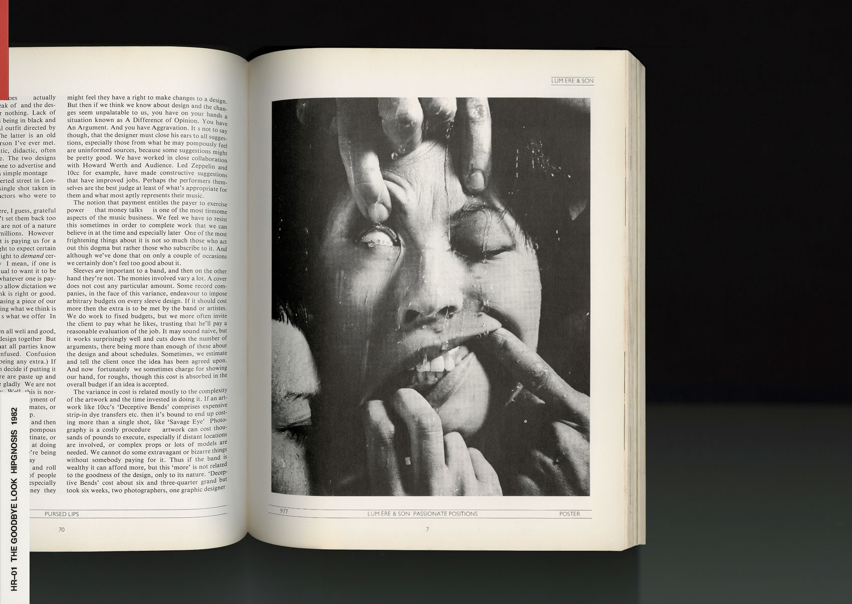
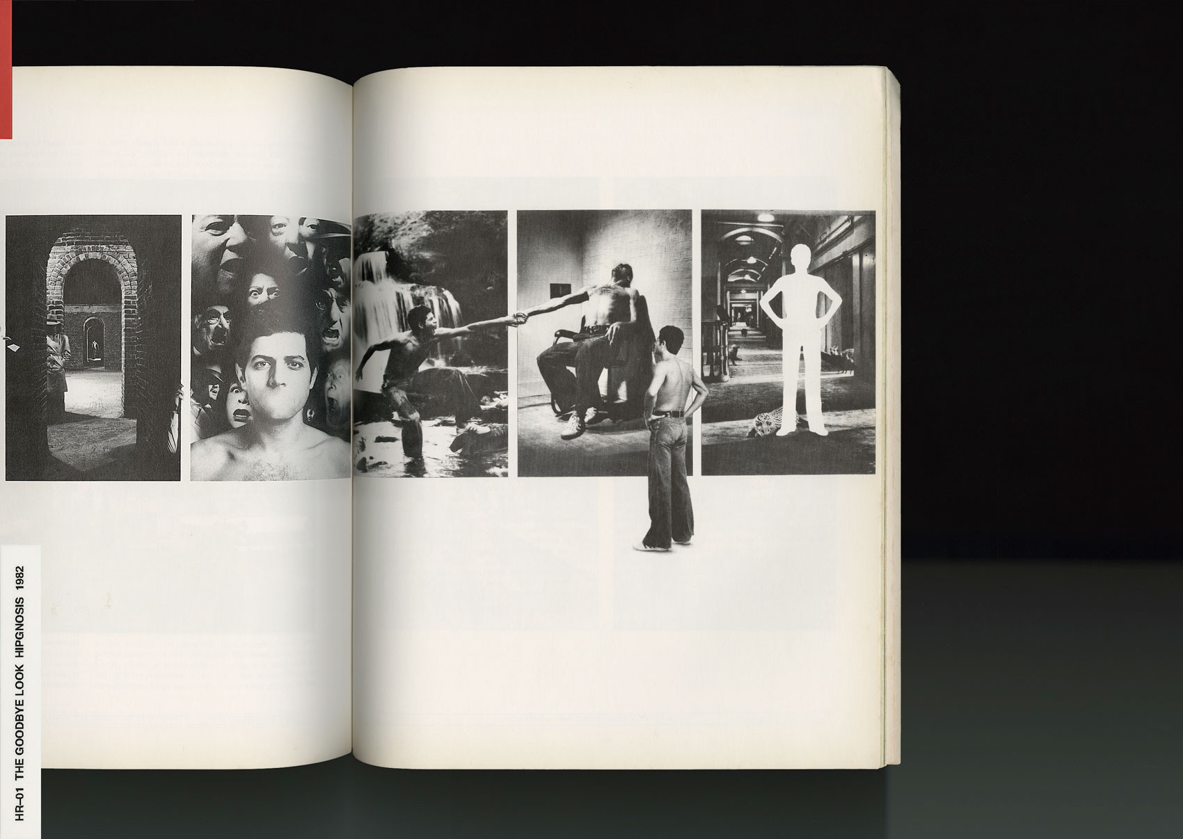
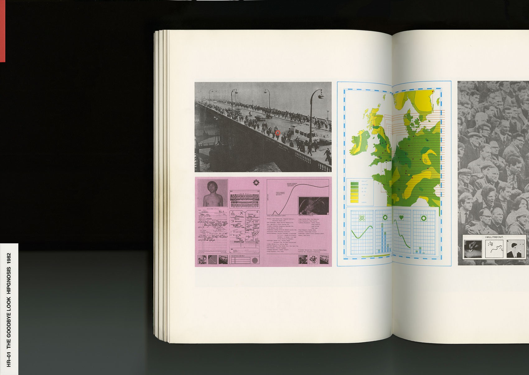
Dollar bin records. Album art01 is something that has always influenced me because you can take it at face value. When I was young, I didn't have access to really amazing books besides the typical skate magazines—Thrasher02, TransWorld03, or Big Brother04. Those really shaped me at ages 13, 14, and 15. Even as I started getting into creative work and realizing I loved art, photography and design, I was still always going to . They had a lot of records from the 70's and 80's that were popular enough to have in excess to just sit in the dollar bin. A lot of those records were designed by Hipgnosis, which was lead by a creative director named Storm Thorgerson. Hipgnosis did the wildest artwork for bands like Led Zeppelin, Pink Floyd, 10CC, and Peter Gabriel. All bands that I didn't even listen to, but they had the most legendary artwork. I would see it and just had to buy it.
Their style influenced me because it was unlike anything else. A lot of album covers are really standard and typical, like a portrait or something. But their work was always conceptual. I always looked at their work—once, twice, and a third time trying to figure out what's going on, and how exactly they achieved it. Hipgnosis did photo montage, collage, and typography all-in-one. That heavily informed what I do now.
As far as finding these dollar bin records, it was just what I could afford. As I got older, I created collages using the records at my house—a hand from this record, a crazy glitch from that one, or a grid from another. I created a lot of old skate and using those records.
NR
What obsessions would be revealed by your library?
HR
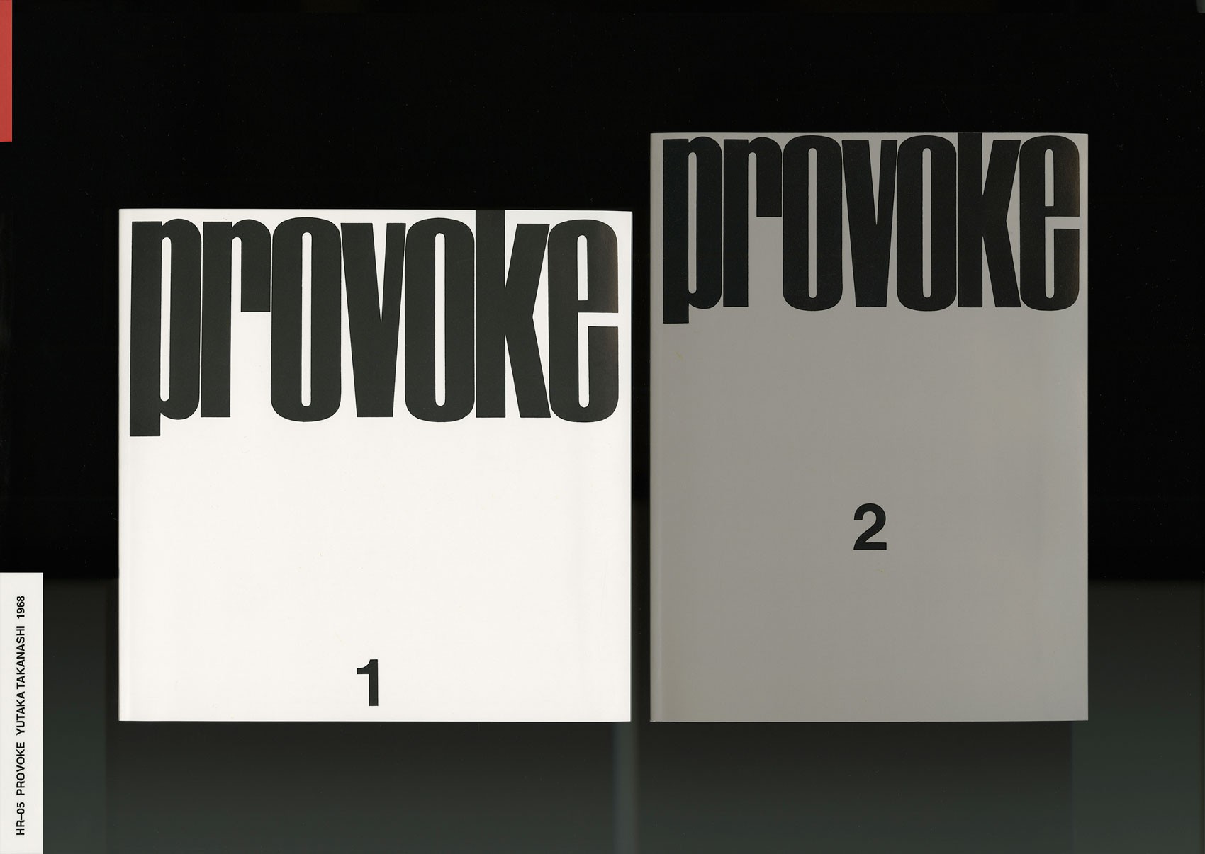
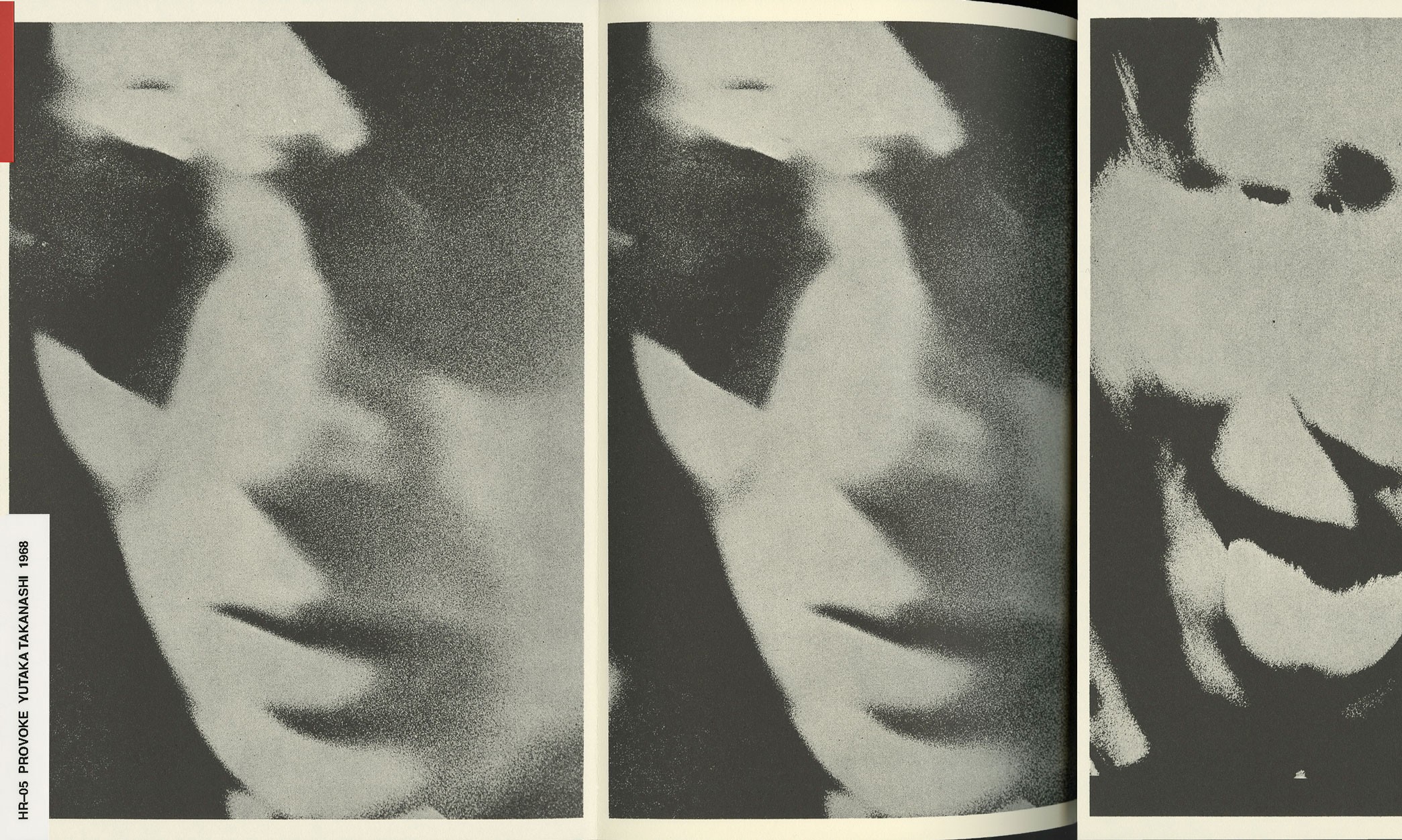
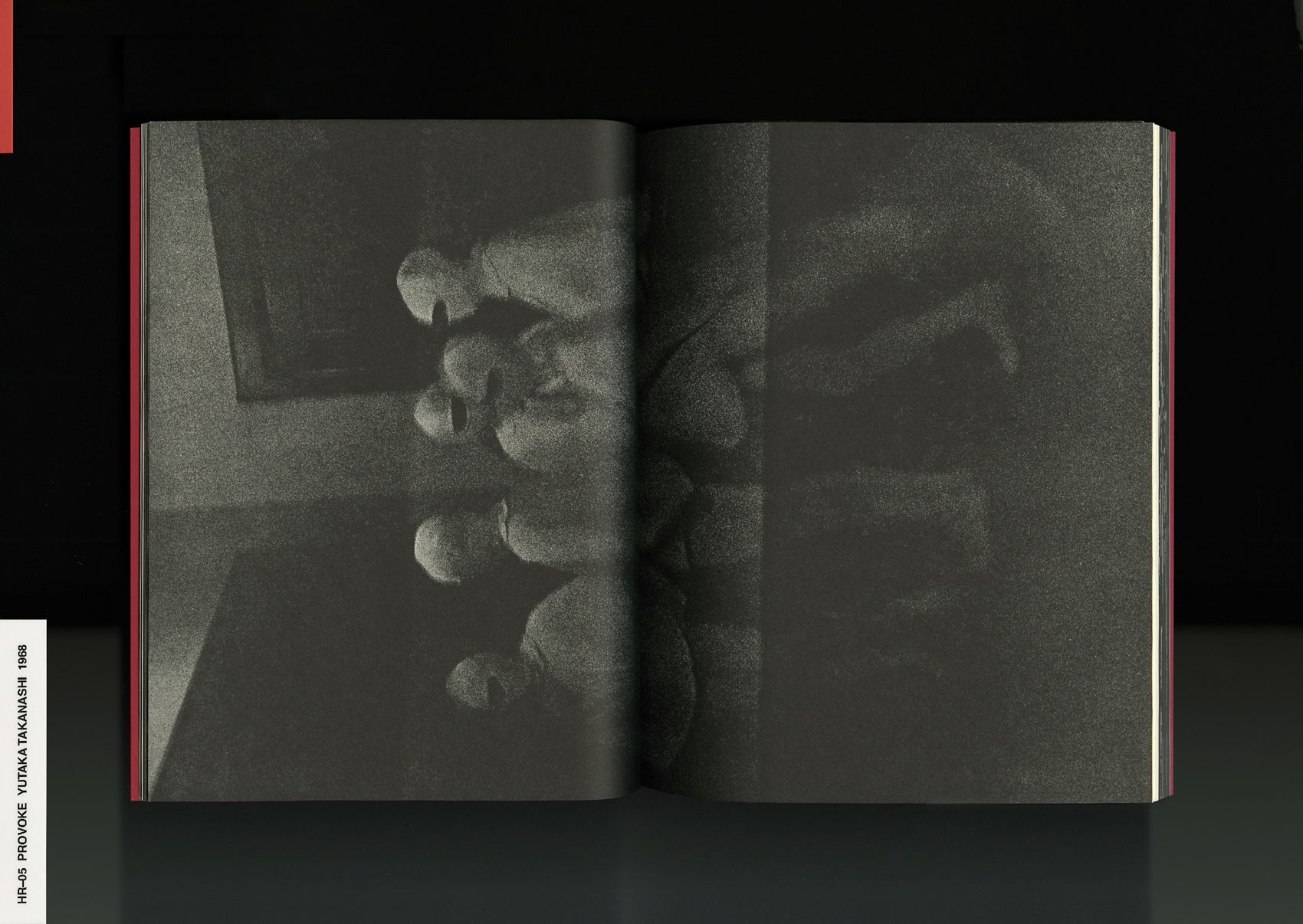
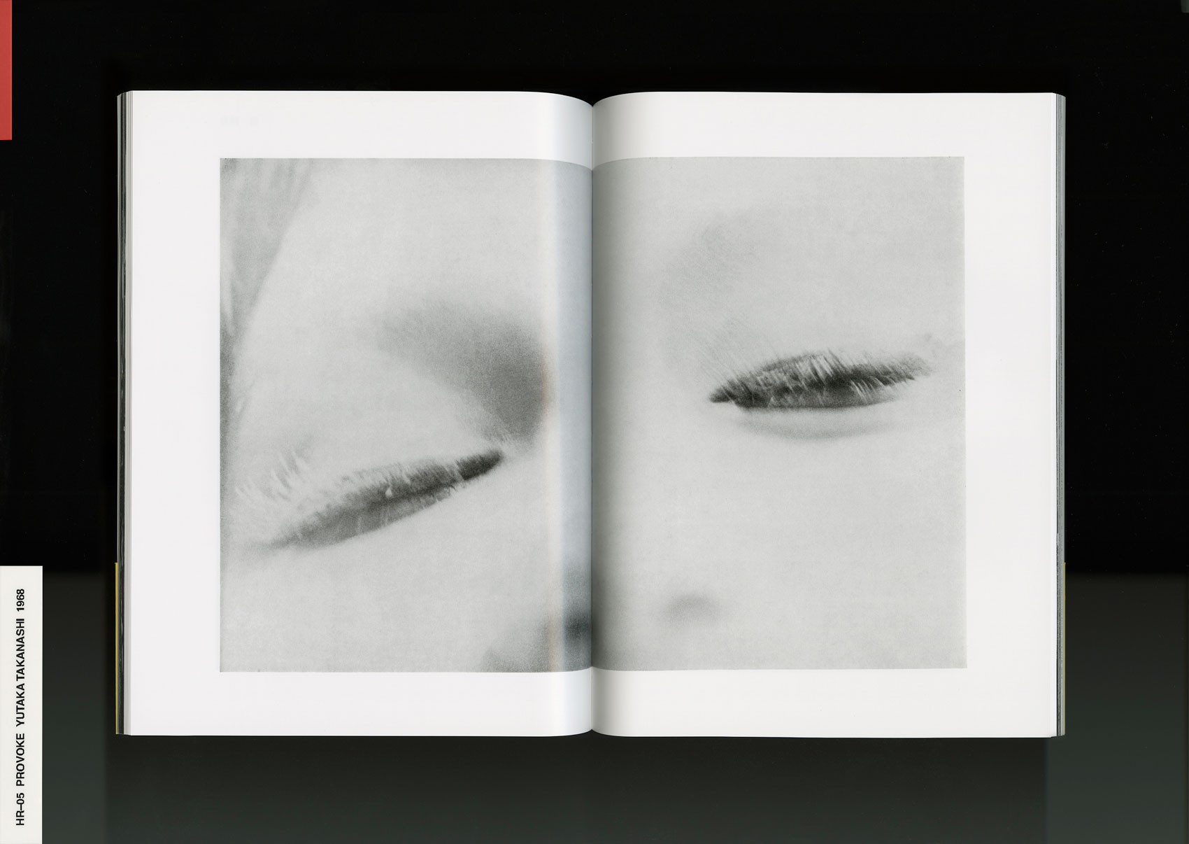
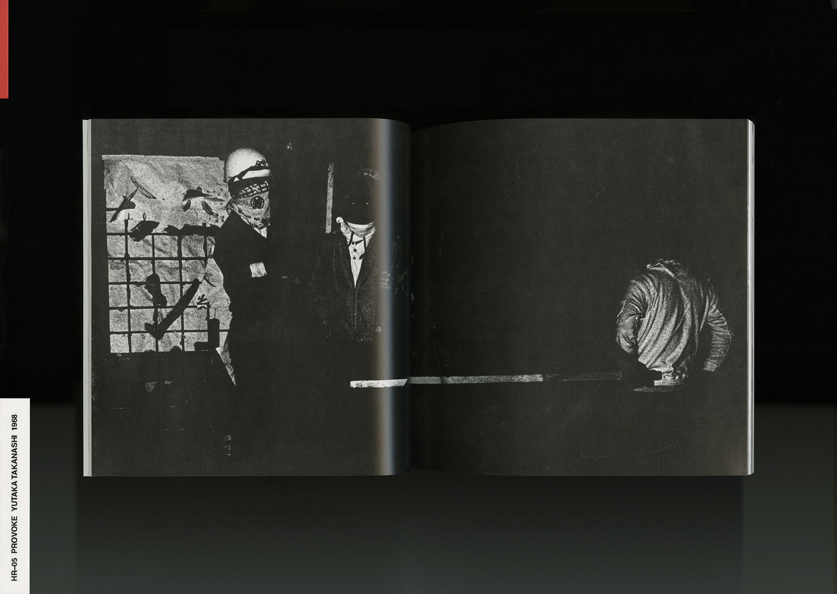
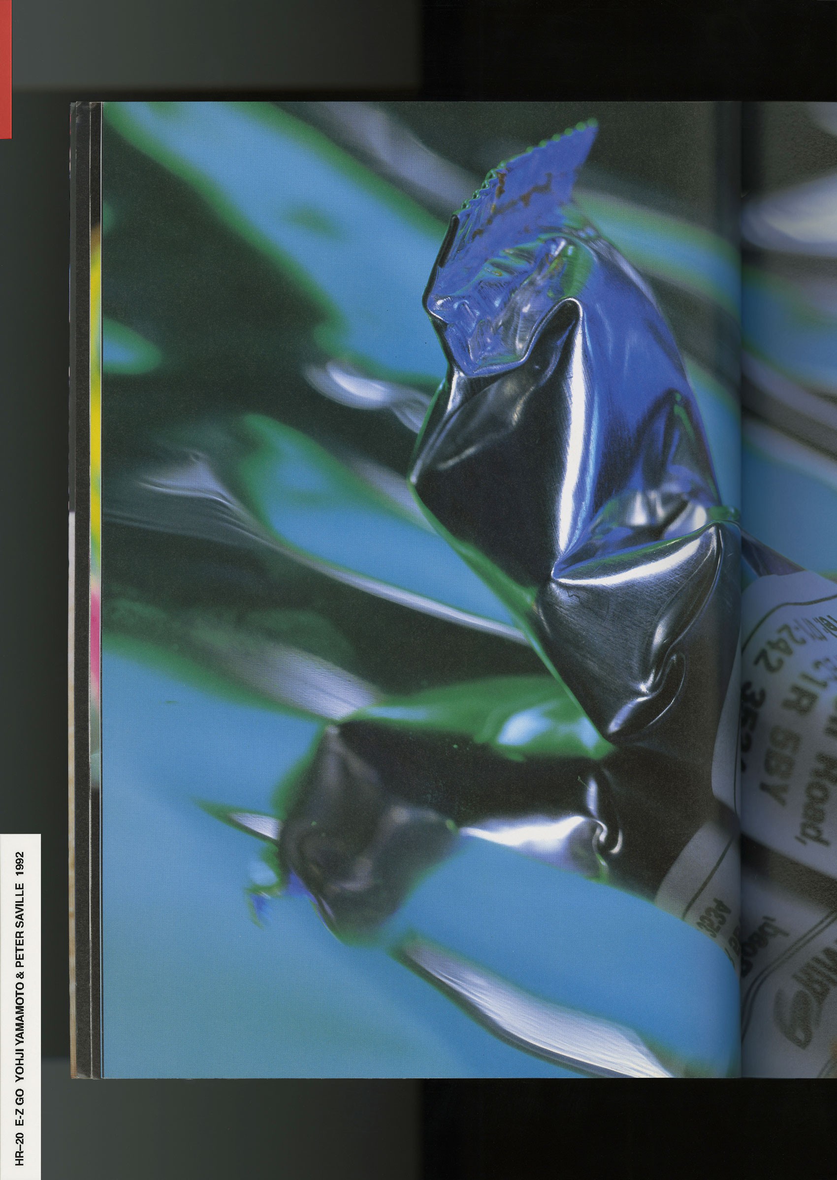
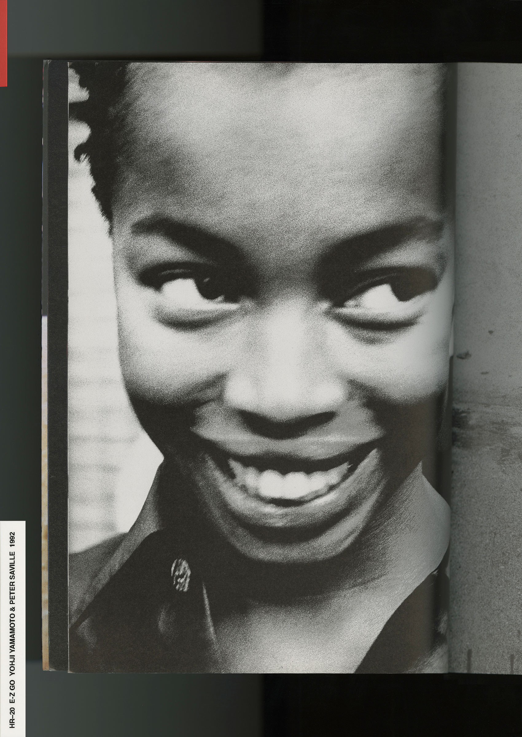
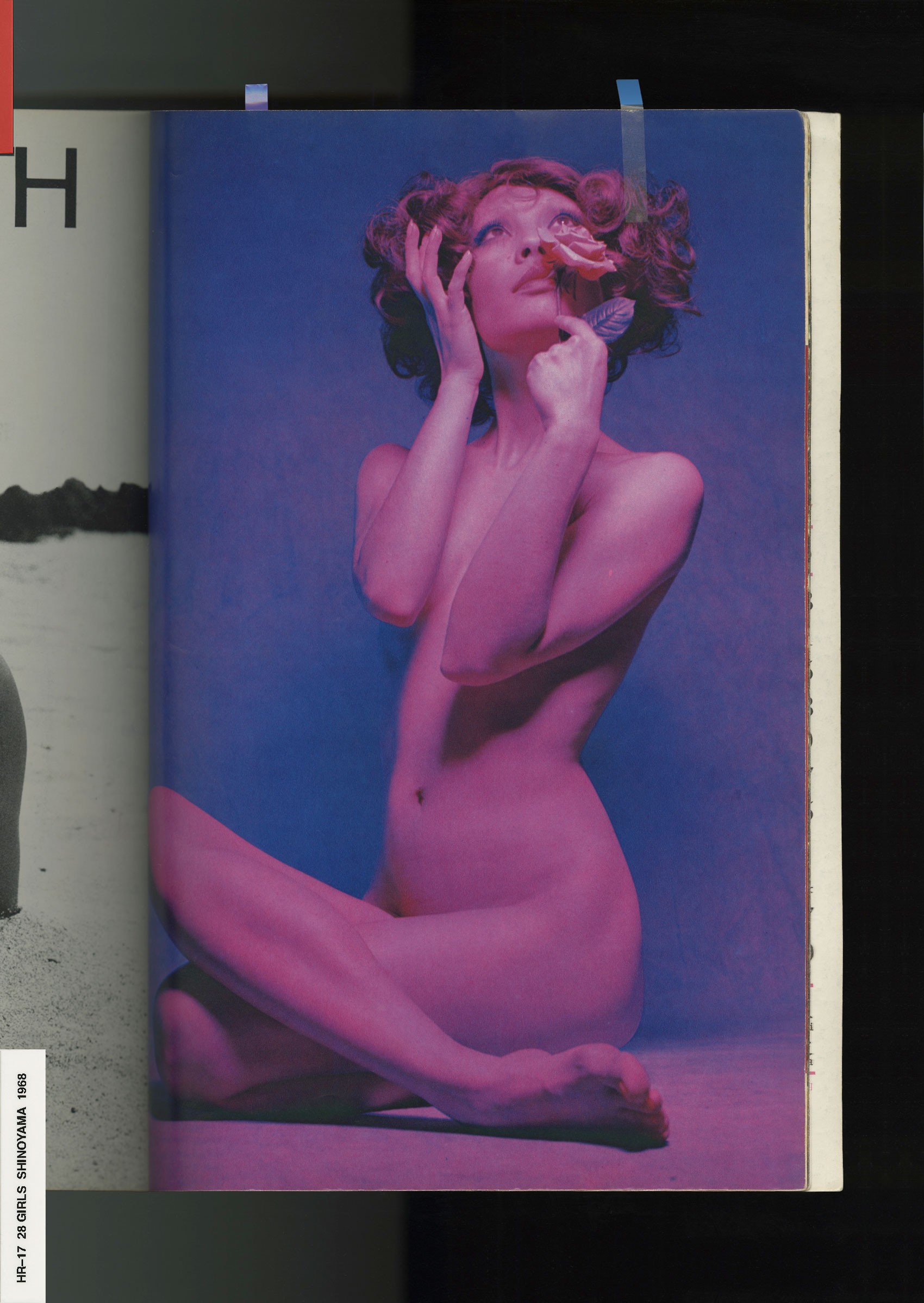
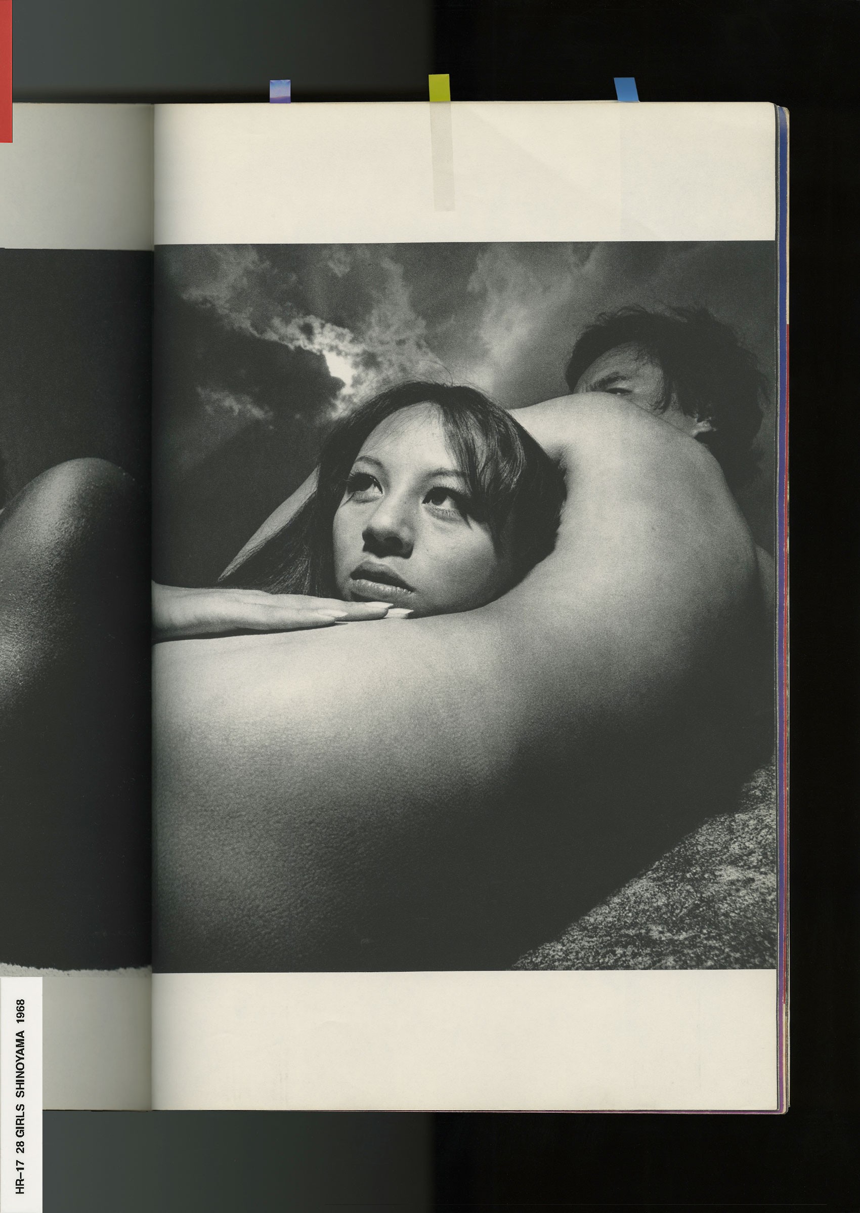
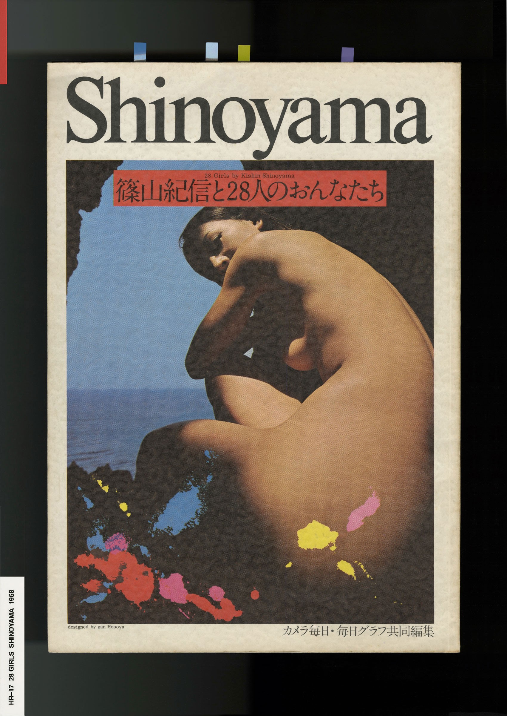
I’m sure you would find a theme. But honestly, it would be easier for someone other than me to point it out. You can see that my work is very much reflected in my library. My work has been described by others as dark, moody, emotional, or monotone. An important element you’ll see in my library are works from the Provoke movement—avant-garde Japanese photography. I have all the Provoke05 books. I have a lot of . Browsing these books, I think you'll start to see how the theme of darkness plays into my work.
NR
What is the significance of darkness in the Provoke movement and how did it influence your work?
HR
Provoke literally challenged readers to question the existing conventions of photography in the late 1960’s Japan. I was immediately drawn to this because it’s a quality I always strive for with my work—to constantly re-envision and reimagine. I can only be hopeful that my work achieves that, but I always strive for it. Provoke was known for a groundbreaking style in Japanese photography called Are‑Bure‑Boke, which translates to ‘grainy, blurry, out of focus’. This was obviously a very sharp opposite to what was the usual style at the time.
Provoke collectively wrote in their manifesto “photographers must go on grasping with our own eyes, those fragments of reality that cannot possibly be captured with existing language. Actively putting forth material against language and against thought." So, what they aimed to do was literally fight the, ‘a picture's worth a thousand words’ convention and create images that acted as language, because they could not be described with words. As someone who often finds difficulty in describing my own work, I really connected with the idea that images are allowed to be totally indescribable.
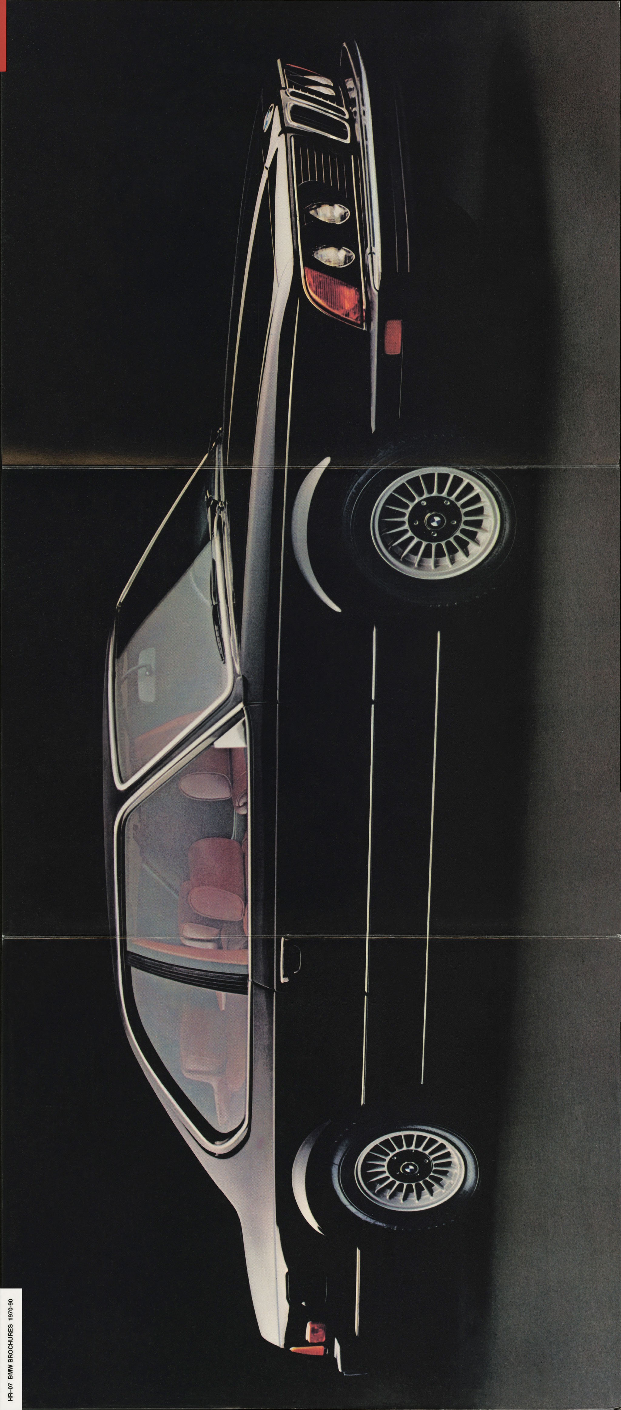
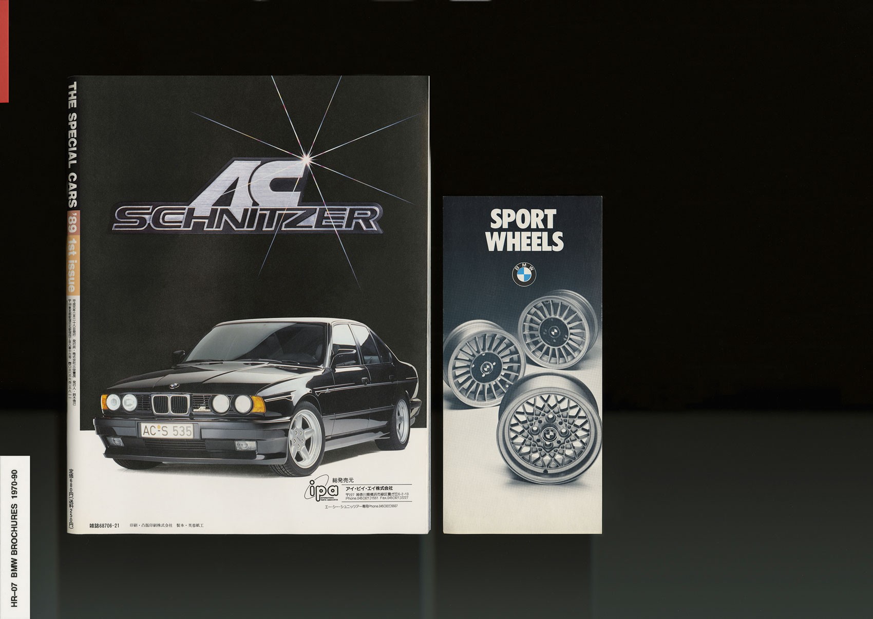
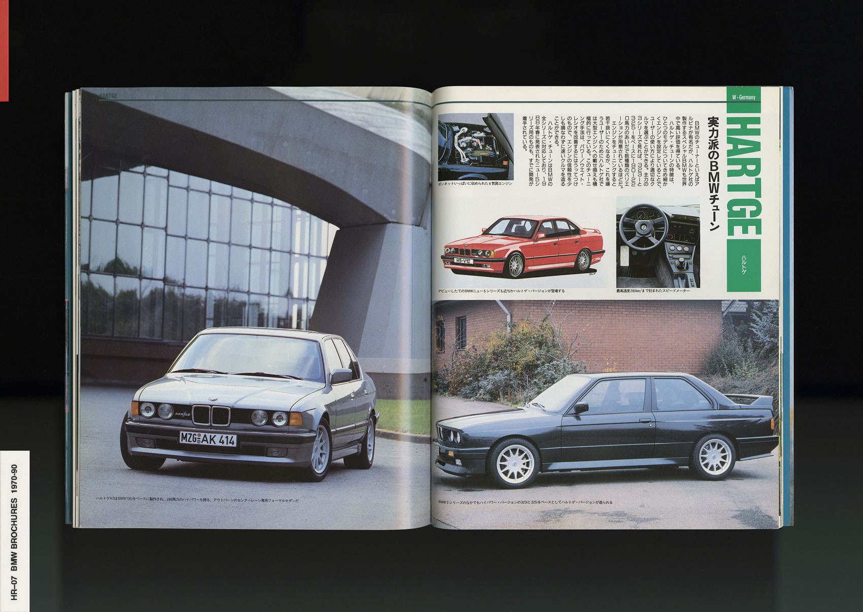
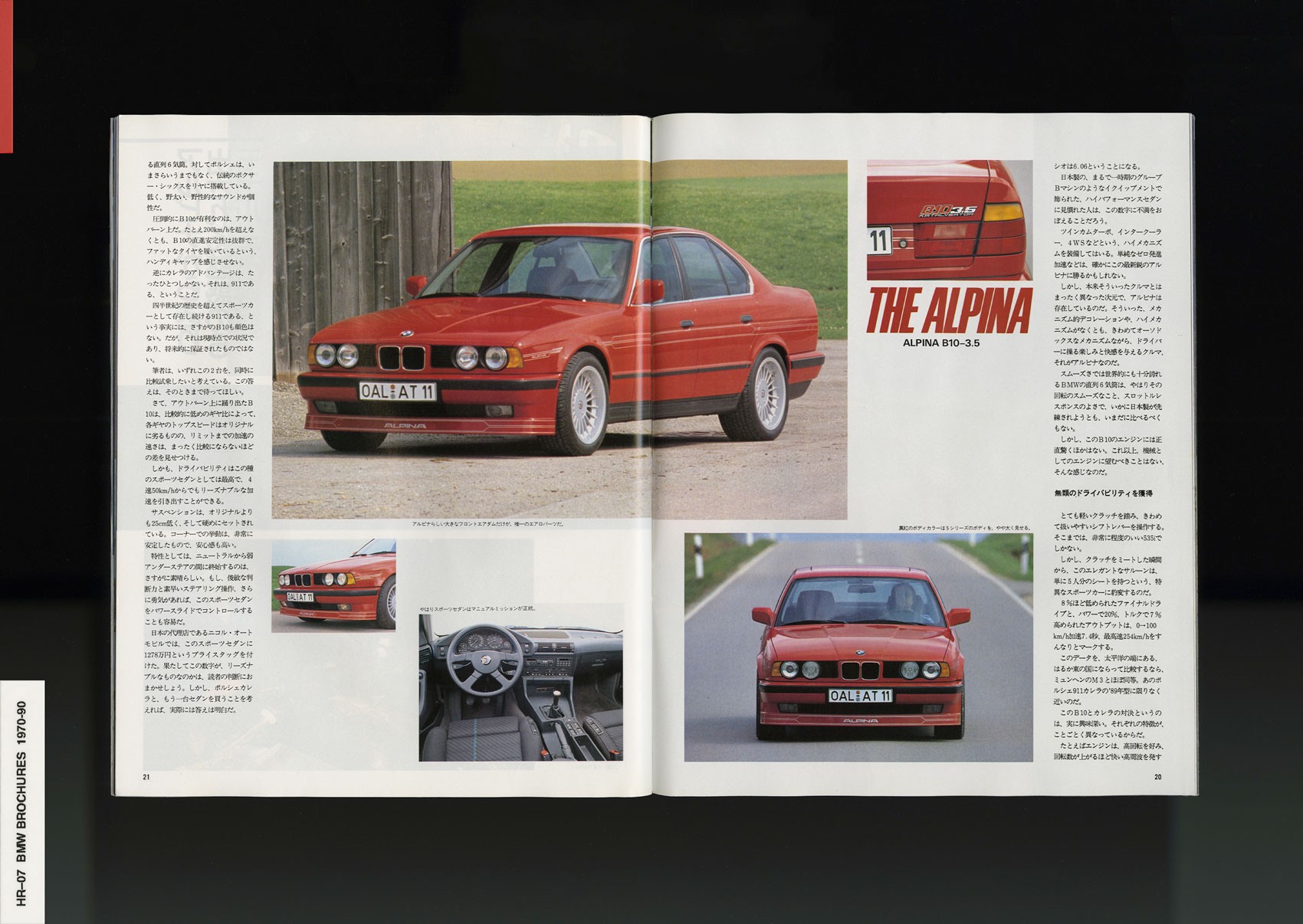
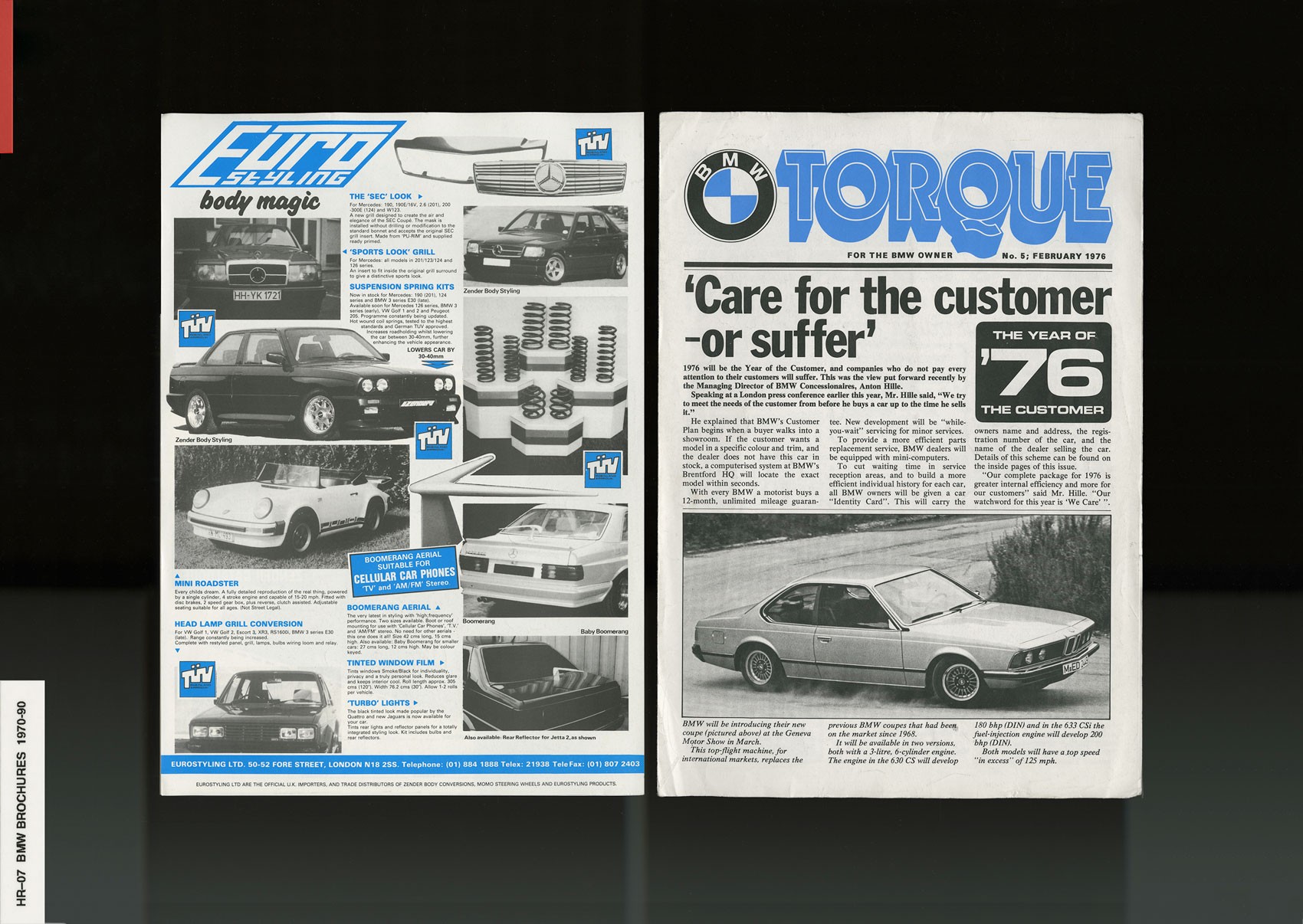
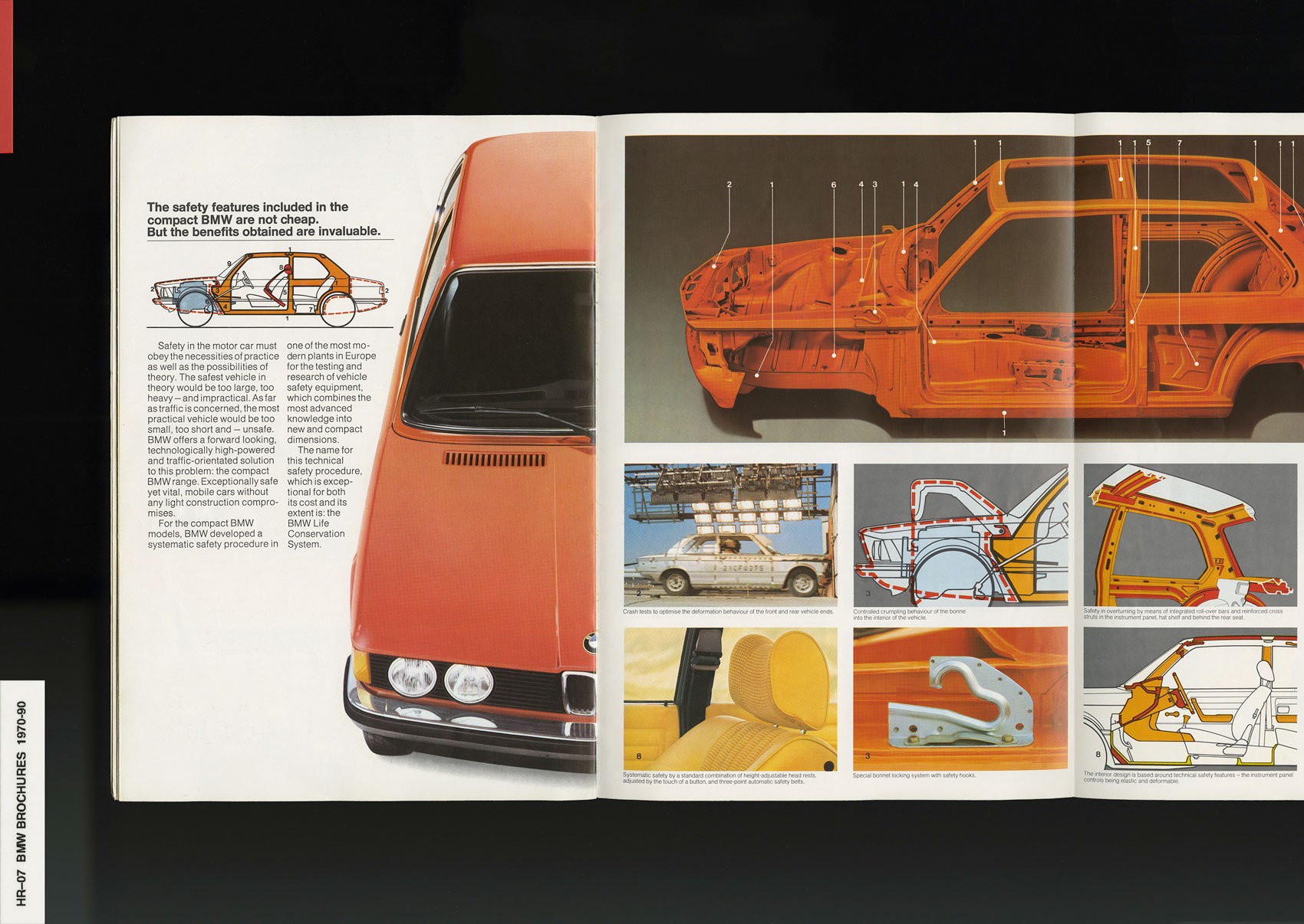
But back to my library: You'll also see that I really love automobiles, vintage automobiles specifically. Not just regular classic cars, but very specific obsessionist German engineering culture. BMW, Mercedes, aftermarket tuning like , AMG, Hartge or crazy 80’s tuners that are not around anymore like and Koenig. I have Tupperware bins full of weird small collections of very specific things like brochures07 and sales pamphlets.
NR
How is your obsession with cars informed by growing up in Los Angeles?
HR
Los Angeles is simply a car city. It was designed that way. Los Angeles had one of the most advanced transportation systems in the world from the 1920’s all the way to the 40’s and 50’s—the —which was dismantled because GM and Firestone wanted to sell cars, and politicians were happy to take their checks. It's absolutely crazy. I visited an exhibition at the Getty that was about Los Angeles and the infrastructure of the freeway system, which is only about 40% completed from what was originally planned in the 1940's. That's largely the cause for what we know as the worst traffic in the universe.
That said, cars are integral to understanding how Los Angeles works. So, I'm from there, and my dad drove a and my uncle drove a . I lived at my grandma's house at the time my uncle was restoring that car—I helped him on little things and watched him put it together. When I was 5 years old, my dad was my hero. He was an electrician at Northrop working on F16 jets, and before his injury, worked really hard to buy this car he wanted. He would drive me from Garden Grove to LAX on weekends to eat and watch the planes take off, our seats reclined all the way back, staring out the sunroof as they flew over us. It’s something I’ll remember forever, an emotion I always try to feel again.
There's this sort of opulence with a very specific era of BMW that relates, in my opinion, to black youth of a certain generation. Being a young black kid growing up in low income neighborhoods, it was less about having something fancy or flexing, but more of a nostalgia-fueled perception of a certain golden era of luxury that everyone wanted to chase. The fact young artists like , Tyler the Creator, Vince Staples, or skateboarders like are attracted to these cars is not much of a coincidence to me.
Not to sound like a BMW salesperson, but the tagline is ‘The Ultimate Driving Machine’ because BMW wasn't making insane hypertuned sports cars, they made that one could fill up with a family—yet it had this agile sporty feeling that makes it fun to drive. So, there's also a bit of accessibility to having a BMW versus say a Porsche or Ferrari. I never wanted a fucking Ferrari, what for?
Anyways, so I always dreamed of having a cool BMW [laughs]. That influences a lot of the books I buy, and things I'm into in general. Lots of vintage car club zines and sales brochures.
NR
Auto brochures are so well produced and functional in an almost unassuming way.
HR
I look at those brochures not as direct design references, but as the entire art of selling something. There's beauty in how they creative directed and advertised Japanese sports cars in the 80’s, like the for example. The photo shoot, casting, styling, the whole energy—you have to create a lifestyle around this automobile. Who is the ideal customer? What does that picturesque driving-into-the-sunset moment feel like?
You'll see a lot of really great references in some of those 80’s-90’s ad campaigns, but equally so in counterculture publications: erotica and bondage magazines, early Hustler, , or Club magazines. Taste levels and standards for producing quality erotica sadly declined at a rapid rate in the 90's, but before that, those magazines had budgets high enough to do the most amazing conceptual shoots. And the specific style of photography from that era actually required incredible skill. The sheer attention to detail— lighting, lens flares, color story, poses—all was hyper considered, because publishing was still a successful business model.
NR
There’s so little money for photo now. I think a lot about the attention economy. Was the photography like that back then when one had the time and resources to go so deep? Less media channels, no internet, methodical analog processes, it was a much more focused activity.
HR
Yeah. That’s what it was back then. You could create this beautiful, elaborate campaign because it was all about like, five incredibly strong final images. Information moved much slower then, and those images were meant to go a long way. Some of those images are still so powerful, they will be ingrained in our heads forever. My favorite example is the famous —the guy sitting low on the lounge chair with the massive speaker blowing his hair and tie. They really, really thought about this one single image. It was so considered, and it truly encapsulates 80’s advertising in a beautiful way to me.
In my library, you'll see I have a lot of books that emulate that same feeling. Like the 80’s ESPRIT06 brand book. It's one of the best examples of a brand that had a consistent vision, concept, graphics, art direction, and packaging—all the way down to their retail stores. Everything was down to a T like “wow, y'all really did that."
Like you were saying earlier about photography, the ‘time economy’ is a good way to put it. Because if you made five images for a campaign, all connected through strong direction, and said “we're running these five images all season.” You're not going anywhere without seeing these five images, all season. But our attention spans are too different for that now. It's gone. It's at the bottom of your feed in a day or two. It’s just about ‘content’. You used to be able to drop an anvil and let it reverberate. Now we’re constantly throwing little ninja stars in the air hoping something sticks.
NR
The image is fluid now. It's no longer this thing that is ‘released’, the image exists as the current moment.
HR
It's here now. Somebody sees it, they are either going to keep scrolling, or knock it off before your product even hits shelves. Consumers see a product and want it now. If it’s not available immediately upon impact, you’ve missed your window. It’s obvious why so many fashion brands are discontinuing runway collections and going direct to consumer.
[Dusk — So, I'm going to turn some lights on]
Overall quality has suffered, because in the economy of time, no one can afford to drop that much money or energy on something that's not going to last.
NR
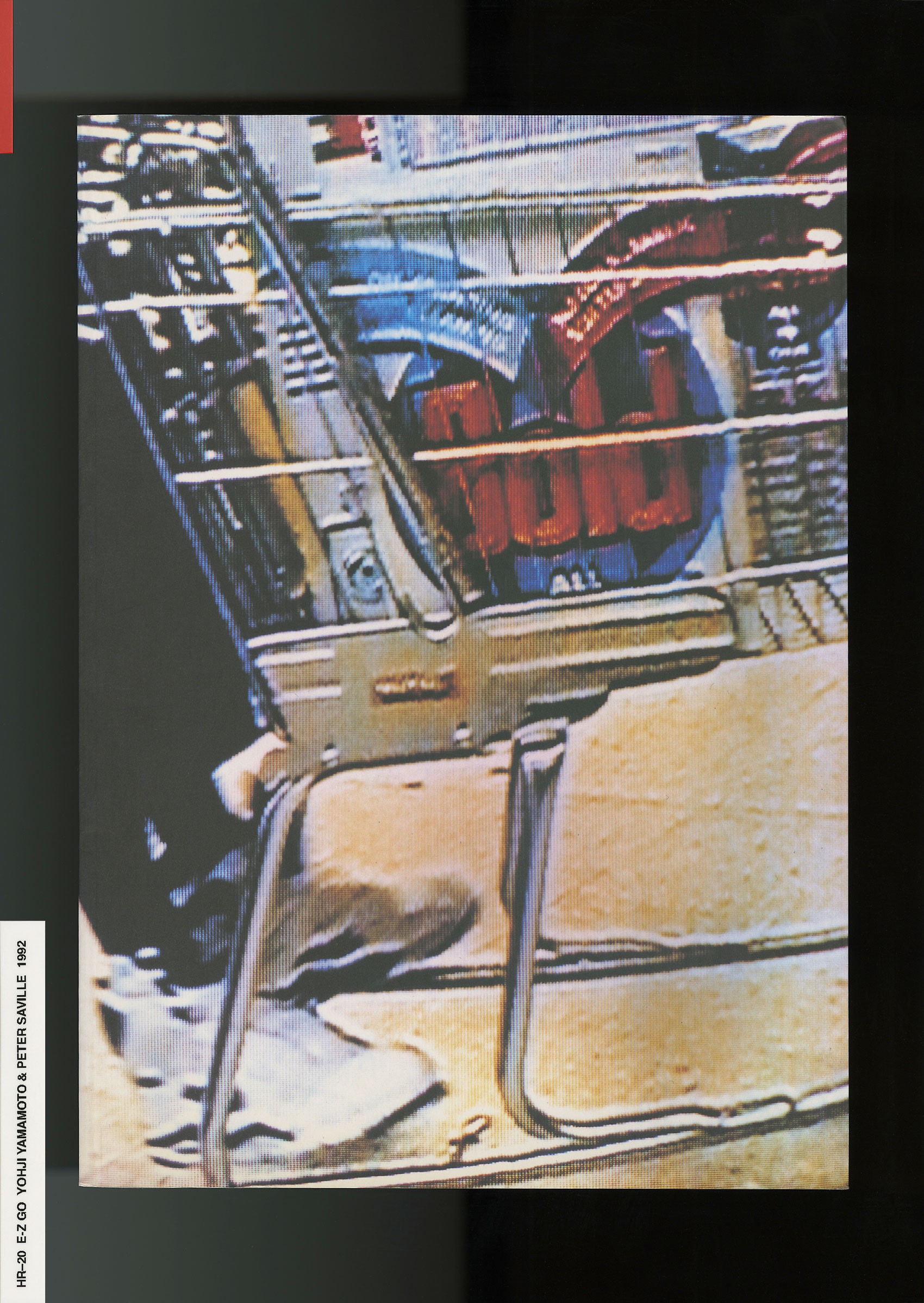
Even the process of making a 500 page book means you're basically spending a year and a half in the past. Looking through archives and arranging past events on pages.
There’s a permanence to it. When you were talking about putting out five images, I was thinking about the team working on that—what is the sentiment and energy around releasing something that literally everyone is going to see?
HR
Totally. It used to be where one project can change the trajectory of a season, a subculture, or even an industry. I don’t think I’ve seen anything have that level of impact anymore…
NR
Or, are we desensitized?
HR
Yeah, I think we're desensitized. I haven't seen anything really change the game or break a cycle, where you're like, ‘Wow. That actually really shook it up’. Seeing people like Demna or Virgil be appointed to really big brands has obviously had a large effect, but I haven't seen any 'this specific project changed the way people do X, Y and Z’.
But maybe I'm not paying enough attention.
NR
Often on Twitter you speak about copying and attribution. You advise designers to seek out source material on topics rather than a singular image as resource of ‘inspiration’.
HR
If you're only looking at and inspired by contemporary images, you're only going to be thinking about now. It’s a direct byproduct of consuming ‘content’ at such a fast pace. That's why I always find myself digging in the past—it helps me understand the possible futures. I see a reference and try to figure it out on a deeper level, how it came to exist. If it's a typeface, why is blackletter significant in that context? Because depending on what you’re looking at, that reference could be a or a from , leading me down multiple research paths that now inform exactly how and why I might use a blackletter typeface.
What is the existence of the specific technique and why? If someone says, "I love Daido Moriyama, I also want to shoot black and white and stuff." Learn about the Provoke movement, and learn about why dark black and white photography was important to Japan in the 60’s, 70’s, and 80’s. Or you might stumble across a striking from The Black Panther. For the designer Emory Douglas, his work existed for a very specific purpose—out of necessity. What was the original purpose and what created the movement? What was the current environment, the cultural landscape, the sociopolitical factors? What was the oven that baked this into existence?
Of course source material can simply be aesthetic, let’s not be a total buzzkill. But without a real understanding of where something started, or the context in which it exists, I find the point of inspiration to be quite shallow. And consciously or not, shallow waters are where the copying happens.
NR
Let’s talk about you as a self-educated designer as it relates to your source material. You have said by not going to school you were allowed the opportunity to show yourself your own history. In what books did you find your history? And how did these sources inform the identity of your work?
HR
It's funny, it's a hard thing to explain because I don't have the actual school experience to compare it to you. So, I can tell you my personal education was basically a lot of random, often hyper-specific interests that I stumbled upon and just continued chasing. Then, after realizing ‘woah, I really like this’ I continued to explore those interests at their core, learning their history, dissecting them further to understand the environment that allowed them to exist.
If we are speaking to a design education, I imagine you just learn about Joseph Muller-Brockmann and probably all these other Swiss or European white male figures that influenced the way graphic design operates. But, for me it was important to see someone that felt like me, that looked like me, and that I could connect to on a more personal level. So for me, that straight up came from various subcultures, not from design. Everything I bring into design is usually coming from another place outside of graphic design. From music packaging, skateboarding, photography, or streetwear. I pulled inspiration from all around me, just whatever I had access to at the time.
To answer your question about specific books, a lot of it was what cool friends or mentors put in front of me. As a kid in the skateboard community, there were people who you looked up to as big brothers. Someone who takes you under their wing and shows you all the cool stuff you’ve never heard of. Or that one record store employee that shows you the slept-on B-sides and deep cuts. Orange County fucking sucked so I tried to surround myself with as many people like that as possible. And at an early age, it definitely changed the way I see the world.
I used to skate like 5 miles to a shop called Carve in Fullerton. This girl named Nancy worked there. I was 15 or 16 and she was 21—I was totally in love with her [laughs], she showed me the whole Director’s Label DVD series, which featured , , and . Once I was in that world I couldn't get out—it was fascinating and enamoring.
I didn't have too many books to be honest. There weren’t really any books that I coveted or cherished because I would still have them. It was mostly magazines—Tokion21 was a big one. It was more about the collective universe of interests I tried surrounding myself with. That was my school.
NR
The intuitive way.
HR
Exactly. But anyways, if you go to design school and all they teach you is systems, then it seems to me that all you are learning is rules. At what point, without questioning the educational system and curriculum that have been around for generations, do you actually come up with ideas that are outside this rule book?
Black culture has always been on the fringes, outside of these guidelines, because we weren't allowed in. I don't want to exist in a vacuum, to only be influenced by other designers, or grids, or systems. As a black man in America, my life experience is of the ‘system’ constantly failing me. From growing up on , living in Section 8 housing, constantly in and out of juvenile hall and , the entire system is designed to keep me within it, at no benefit to me. My whole purpose of using a grid in my work today is strictly so that I can break it. I have to defy it at all costs, because the grid was not my friend. That's my ethos.
NR
As you outlined, in schools, the history of design is disproportionately characterized through the eurocentric white male experience. Many histories are barely visible such as people of color, those in marginalized communities, and non-western cultures. What books would you recommend students to provide them with a balanced design education?
HR
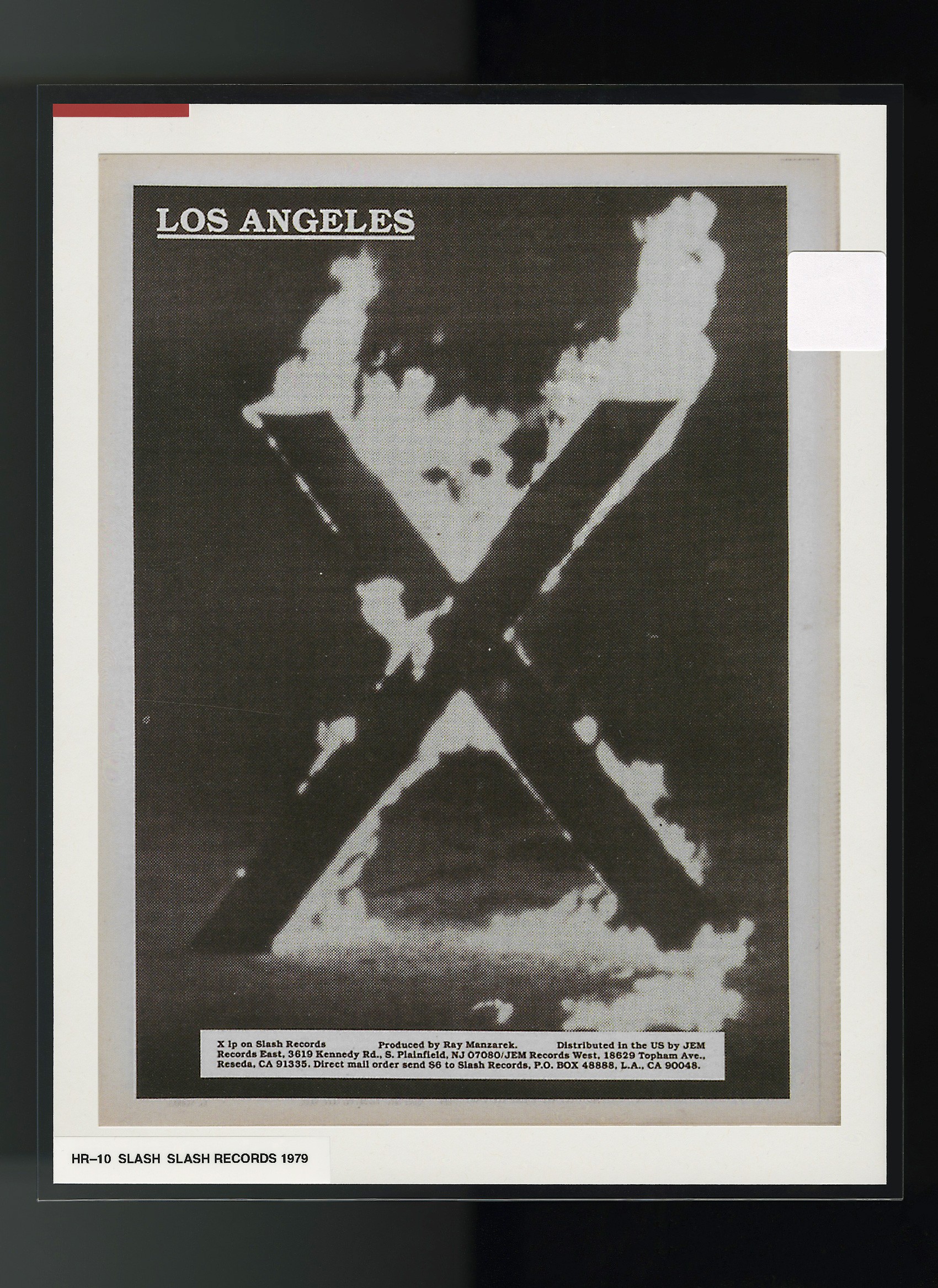
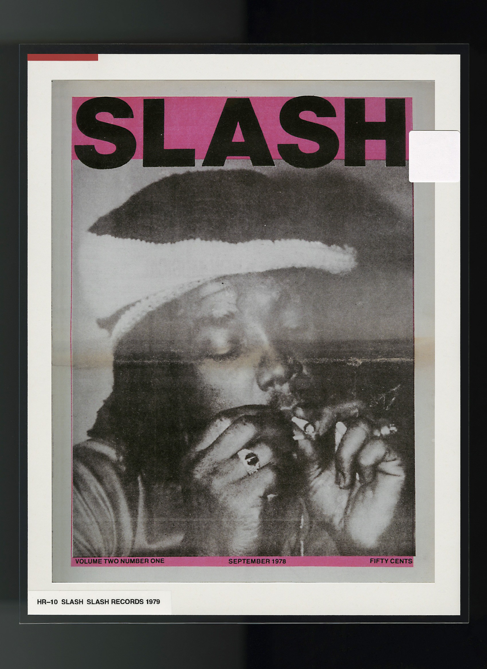
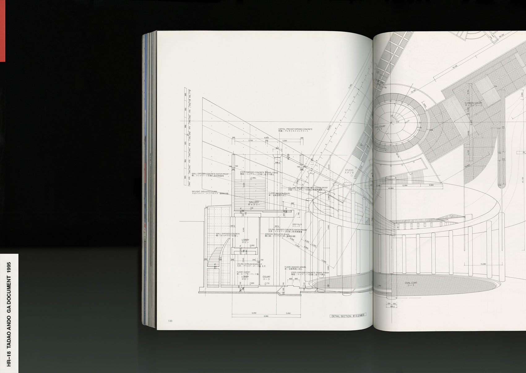
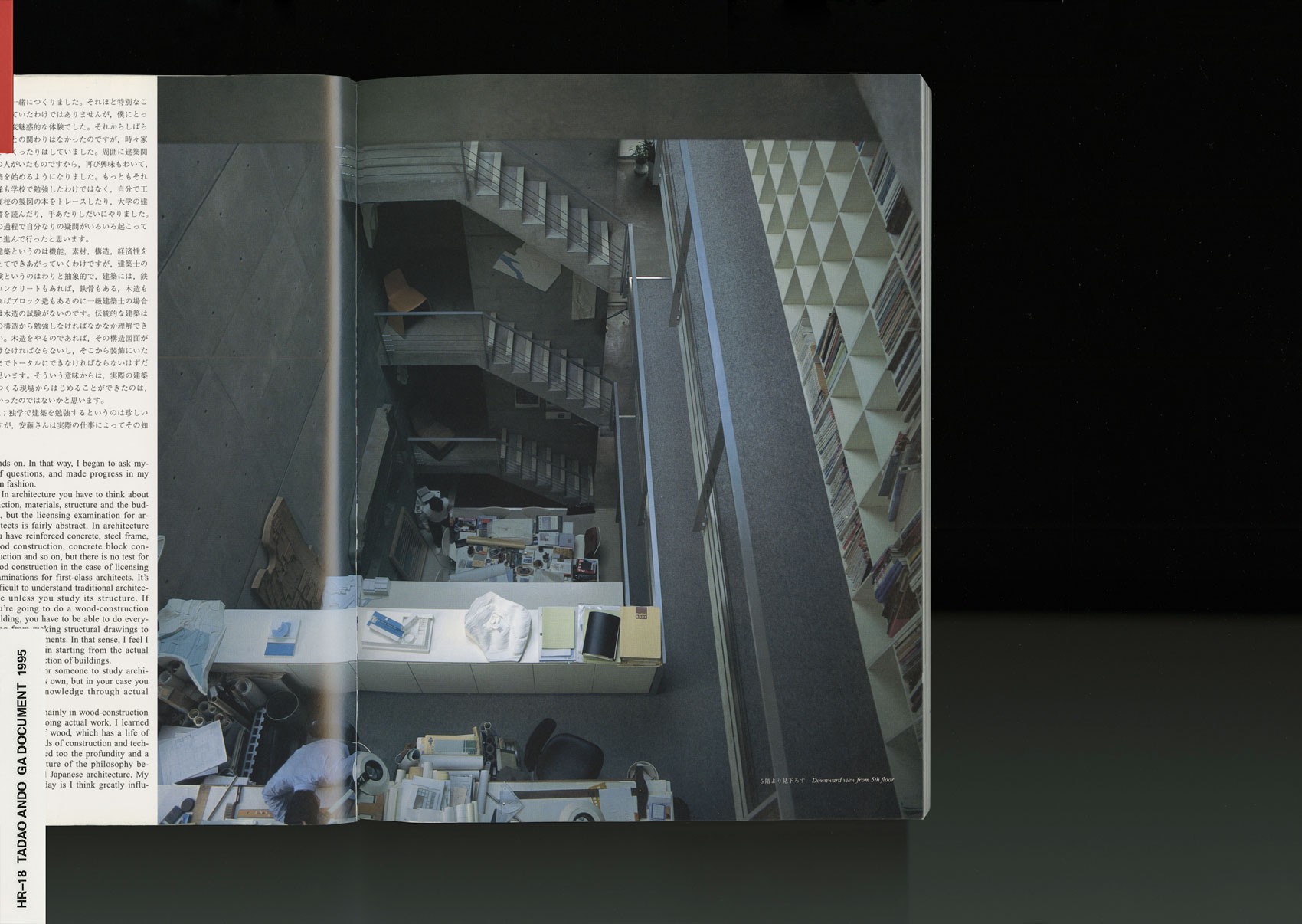
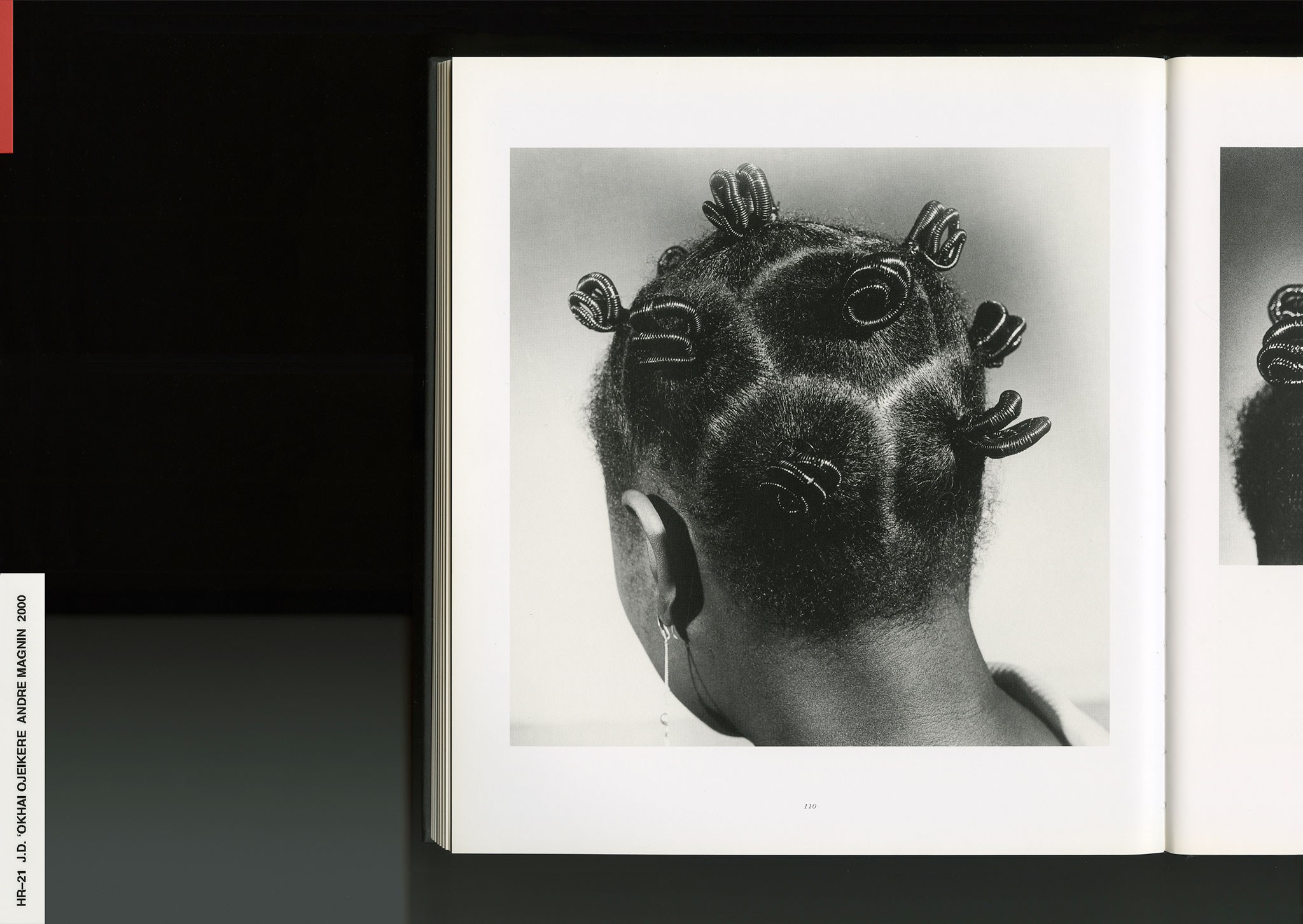
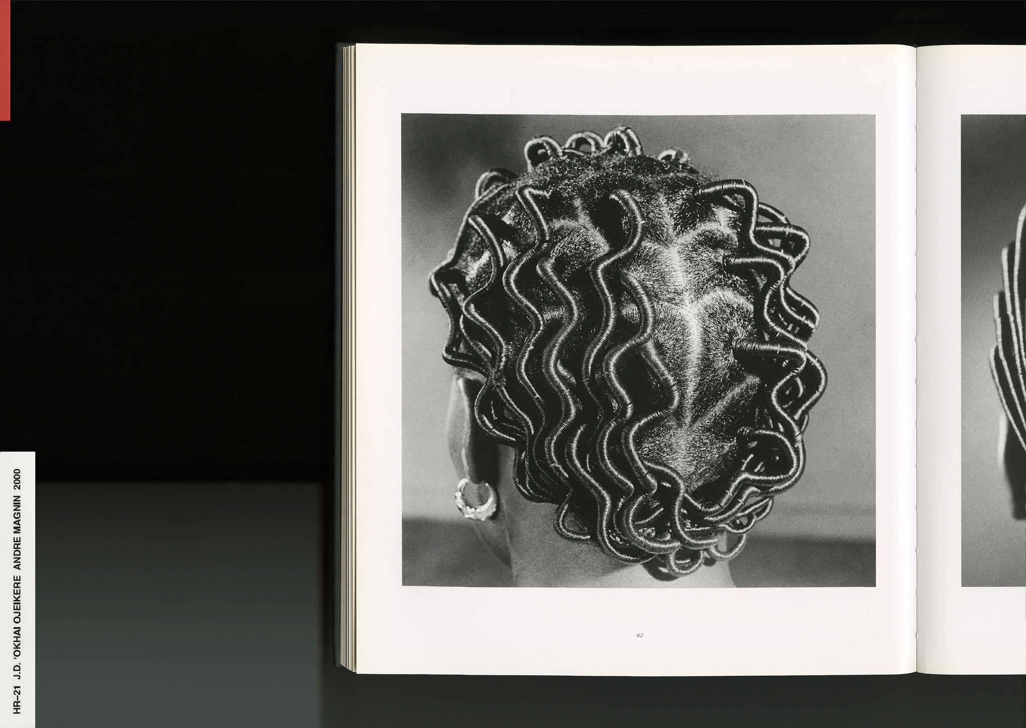
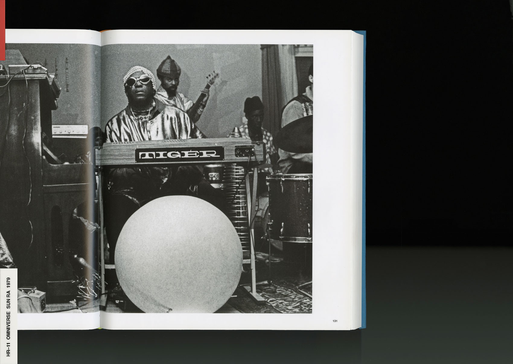
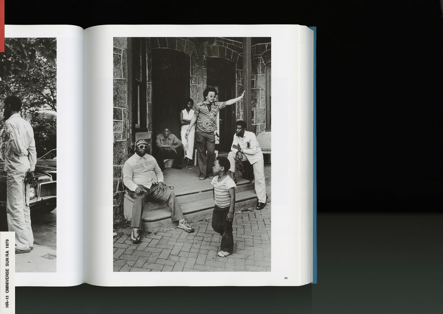
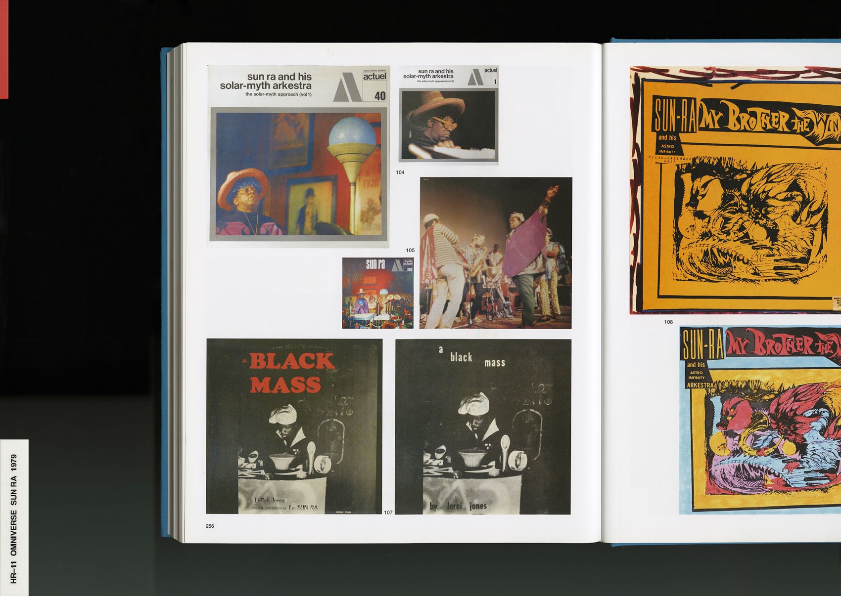
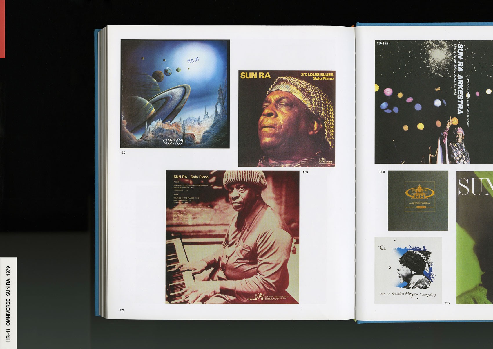
For the record, I'm not an authority whatsoever for recommending books based on any institutional criteria. But a few that really helped me were Nikki Giovanni: Gemini08, Airbrush Art in Japan09 (both volumes), Slash10; a punk magazine from Los Angeles. Hipgnosis: the Goodbye Look, Sun Ra: Omniverse11, J. D. 'Okhai Ojeikere: Photographs12, and lastly, Jason Moran’s Walker Art Center Monograph13, which I designed. Some of the essays by Adrienne Edwards, Glenn Ligon, and Okwui Enwezor changed the way I think. I got to be really intimate with the text while designing that book, which had an all star lineup of authors. So that one really pushed me.
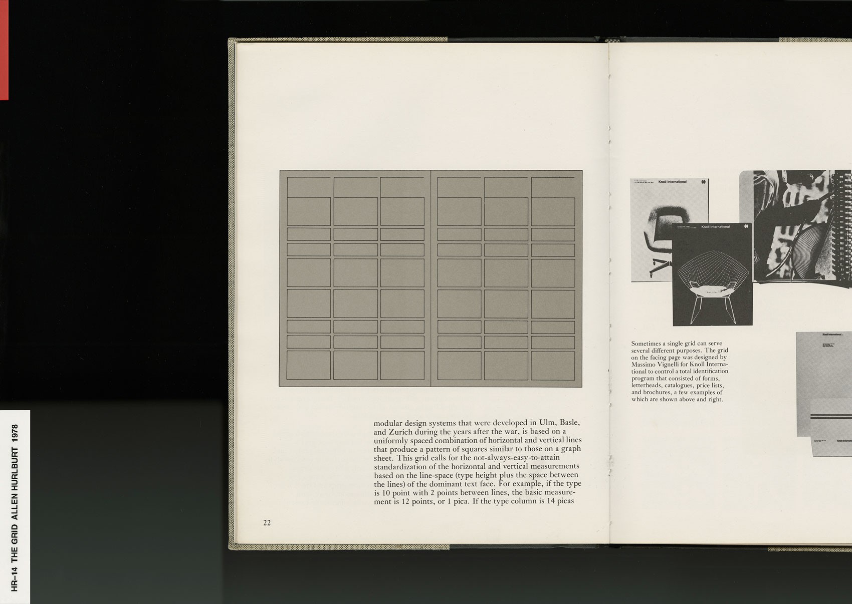
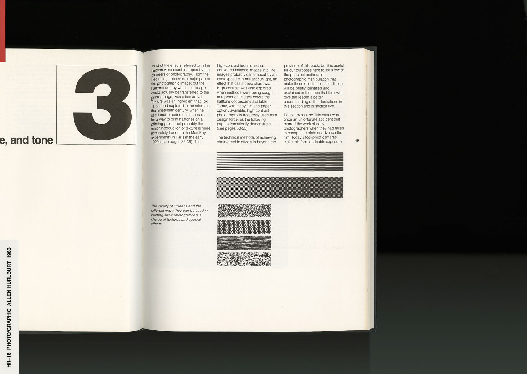
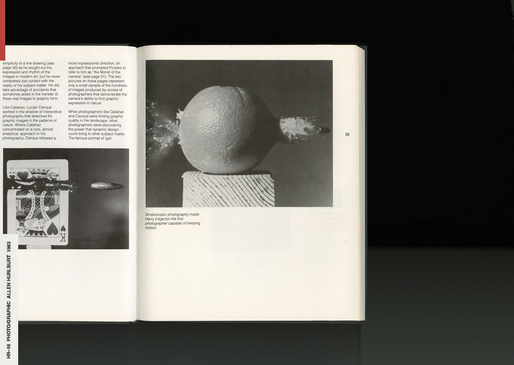
Another one I want to put out there, which is funny, and not necessarily a recommendation, but an example of navigating my own education. So, on the exact opposite spectrum where asked, “What would you recommend for designers to have a versatile education”—since I didn't really have the formal education that they got, what I did was I started buying some of the books they study in curriculum. So I got a couple books by Allen Hurlburt14—one of them is called The Grid15 and one is called The Design Concept16.
This was many moons ago, but some design studio I liked and followed (forget who it was) compiled a selection of books as a “required reading” of sorts. I guess young designers and students emailed them so often they just set up this FAQ page—which I’m now realizing is a genius way to slim your inbox count [laughs]. When I checked the list, I noticed all of the books were exactly what we’re talking about—the white male Eurocentric curriculum. In my head I was like, “I'm going to buy these”—but at that time I didn't buy them as a joke, I was genuinely looking for advice and resources. But looking back at them now, I realize how much of this stuff is actually important to me and how much isn't.
HR
It was good to read these materials from my own perspective, not shoved down my throat as the holy scripture, you know? I’m like, “OK cool—I got this rad techno album art book that I found on Amazon for $3.79, but then I also have this one that dissects composition and visual harmony”—which was really helpful, because despite tossing out the rule book, there are definitely methods on how to make something pleasing to your eye and brain.
I usually extract what I can from those books. But the rest, which is like ‘do not set your type like this’ or ‘all kerning should always be ‘X-Y-Z’, that’s where I started to draw the line between prescription and preference. I almost intentionally break these rules now, to the point where I kern letters of a word to almost seem like two words. It leaves some designers tripping, trying to decode whether it was intentional—which I absolutely love [laughs]. I lean into the imperfections, exaggerating them a bit just to fuck with people sometimes.
NR
Yeah, to have them reconsider their conventions?
HR
[Sips drink] Mhm. So anyway, those are a couple of books that I bought trying be on the other end of it. And these are some books I’d recommend for students who are maybe on my end of it, too.
NR
Anyone who follows you is familiar with your vintage book hauls in Japan.
HR
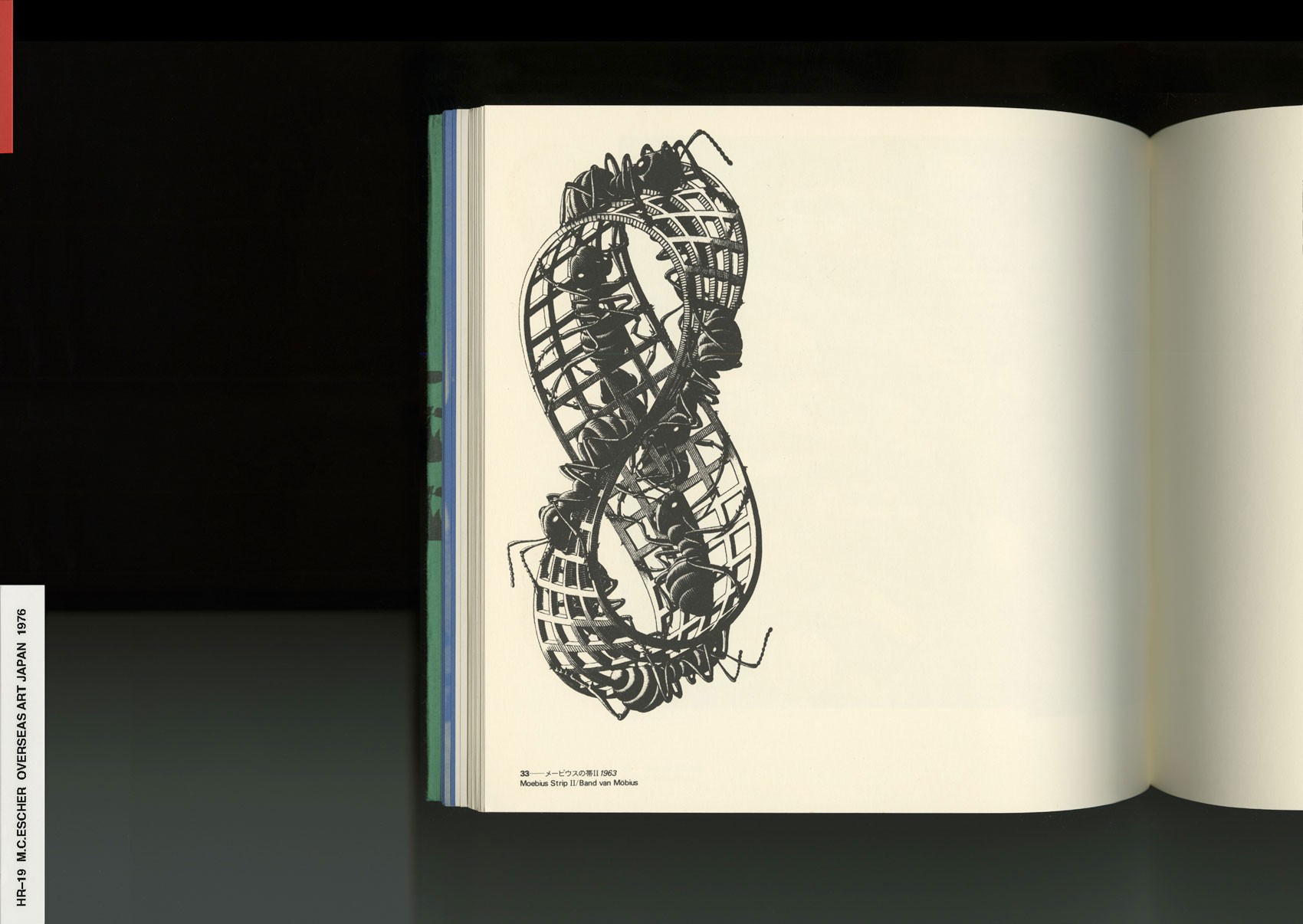
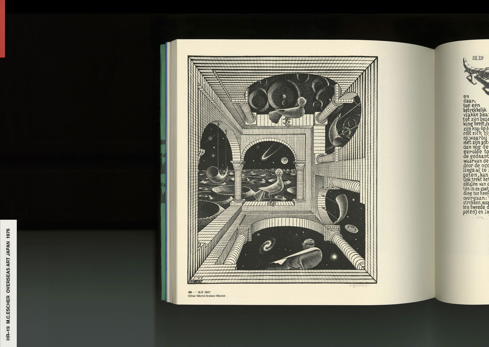
I go to Tokyo a lot—it changed the way I think about books because they are cherished there. Books are cared for, well-maintained, and last a long time. Every business there is run by someone who is very obsessed with a super-specific thing. From 90’s teen pop culture magazines, photo books, , to automobile brochures. I am able to really learn there just by digging, talking to people, and doing my own research afterwards.
And for the record, we’re specifically talking about art books right now. Period. I'm not an authority to speak on literature at all, but for photography17, architecture18, illustration19, art, fashion20, design, all that stuff—Japan’s a mecca. I leave Japan enamored, and I leave Japan broke.
NR
Italian journalist Angelo Flaccavento said, "As a designer, no matter how hard you try, you’re only truly modern once in your life. It’s impossible to sustain or replicate that particular moment."
Some designers are relevant for 1 month, others 50 years. Why can some designers understand the codes of the times longer than others? What are your thoughts on this—why do cultural cycles and aesthetic trends cannibalize designers? Has this process become accelerated in the age of the internet?
HR
Yeah. So there's a few questions there. So the first one was why do you think designers can't stand the test of time?
NR
Yes, speaking to the cultural cycle being larger than the creator as an individual.
HR
So there is a classic motivational poster that says, "Things of quality have no fear of time." That's something I absolutely live by. I'm not above a motivational poster [jokingly shrugs].
If you're only looking at and inspired by contemporary references, it's really difficult to bring something completely new to the table based on the current way of thinking. But, what are the things that really worked and why? That's why I always find myself digging in the past. Not just for nostalgia’s sake, but things were really done differently back then and you have to consider that.
There's a reason why I don't just put up all my work immediately. There’s projects you have never seen that I fully worked on. I just posted a project that I completed over a year ago. I have to let things sit. I let them cook. I look at them again and again and I think, “Am I going to want to delete this in six months? Am I going to want to archive this post, or wish I never even showed it?" I also like having a few easter eggs to pull out later.
A lot of designers, artists, or photographers release work immediately. This is just the speed of our culture, you kind of have to immediately post things you create, as posting the right thing at the right time can really dictate so much for an individual. The same way a record you bought in high school can change your life forever, I have seen people post one project that’s virality catapulted their career.
There’s a weight of acknowledging that which stresses me out. It causes me to over-consider the effects of something that should probably be more of a fleeting moment. But I know that I'm super proud of everything I do show, and by the time it reaches the public, I'm content that people may connect it to my name for eternity.
I'm less concerned with being at the forefront than making lasting work that impacts people, and really touches someone. I strive to achieve that exact feeling we all felt before, what I touched on earlier. I want to create that record, or thing in general, that changes the trajectory of a kid’s life.
NR
What artists have helped you understand your practice better?
HR
Great question. A hard one though. I don't know if there are any artists that I can really attribute to helping me understand my practice, because I am still learning so much everyday about how I want to work and what I need to comfortably have a sustainable practice. I always thought, 'Okay cool—if I'm going to be a successful art director I should start a studio, get a space, hire designers, a studio manager, and then build up to take on larger projects'.
But what if I don't want to do that? Maybe I don't like getting up and going to an office everyday. Maybe I need to have complete weeks off from work where I'm just exploring, researching, doing personal things. Maybe it’s that dormant week where an idea just hits me, an epiphany so inspiring I spend the next week just grinding nonstop, doing all-nighters because I'm so motivated to make this idea exist.
I was on my friend Mary H.K. Choi’s podcast recently, and we both jokingly concluded that my brain and process is more that of an artist, yet my career and actual work practice is more that of a designer. I’m constantly exploring and finding different rhythms that work best for me. I find more parallels and draw more inspiration from fine artists and musicians than I do from designers or creative professionals.
I love the term ‘album mode’. When rappers delete every photo from social media and change the profile picture black, reset the whole energy, that’s when you know some heat is on the way. [laughs] My instagram vanishes at months at a time. I wish more people understood the need to isolate. When I come back, I'm going to have birthed this beautiful thing that I'm so proud of, and will want to show for the rest of my life.
So I guess to answer your question: Rappers.
NR
Collage is prominent in your work. An image is sourced, processed, and re-contextualized with other images. In your source material, what cultural moments do you seek to communicate your point of view?
How do you engage these historical moments in a contemporary conversation?
HR
I seek to create intrigue. If I pick up something that genuinely intrigues me, it's because it provokes more questions than answers. I constantly feel like I'm trying to crack a code. I want people to try to connect the dots. If you look at it and immediately get it, if the image tells you all you need to know at face value - then what’s the point? I like to peel my own fruit.
Most of my early work references were simply lifted from the era I grew up in—the mid-nineties. My New York Times illustration of jumping a hurdle is the perfect example of that, because it was in the prime time pop culture canon of 1996-97. The photos used in the piece are from the ‘96 Olympic Games in Atlanta. When you're a kid, these things seem larger than life and fantastical, which is how memory works. But as my horizons have expanded and I started looking beyond personal nostalgia, I started discovering things from many eras before my time.
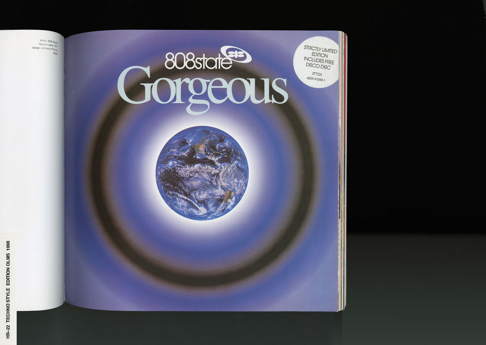
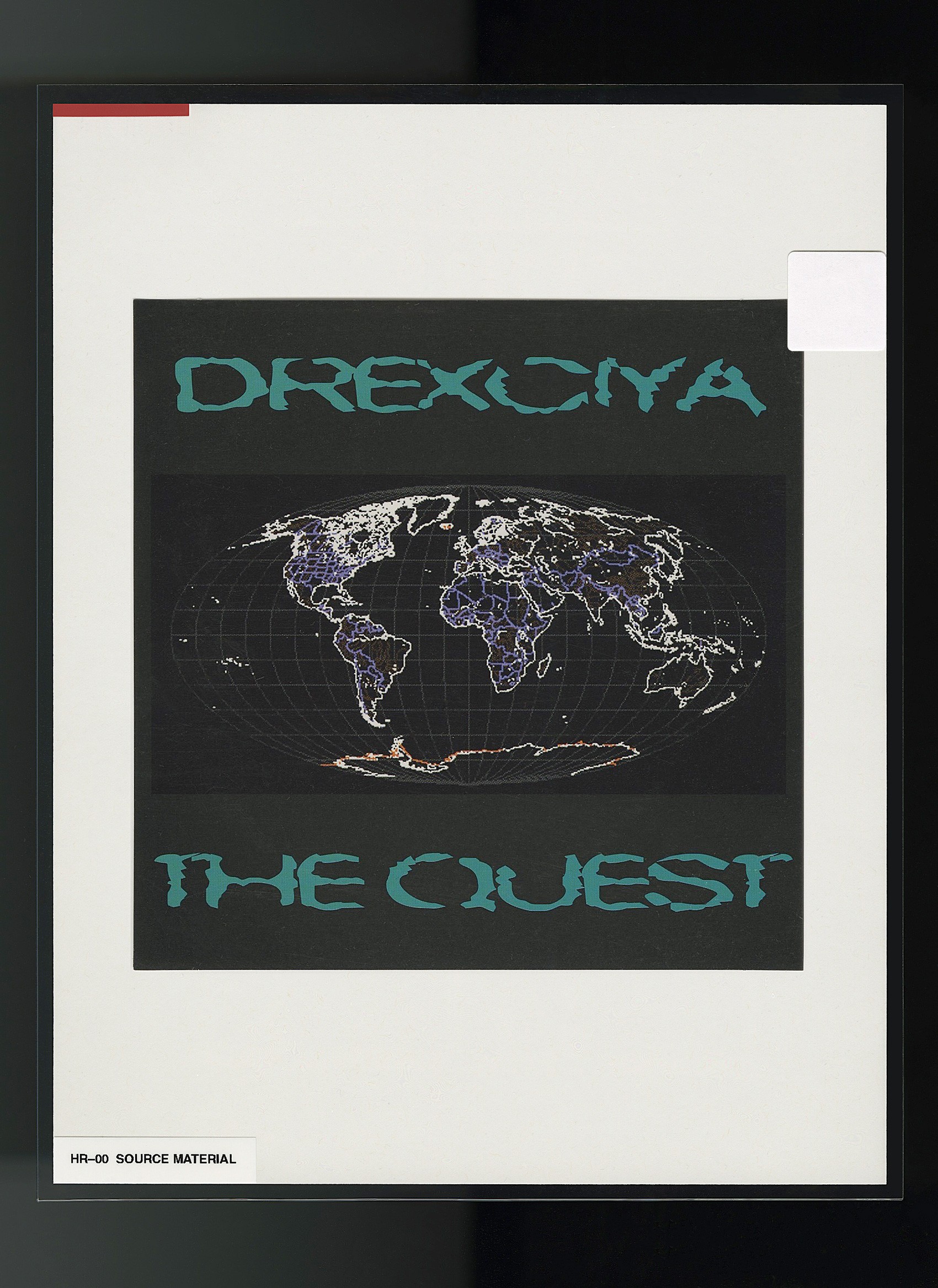
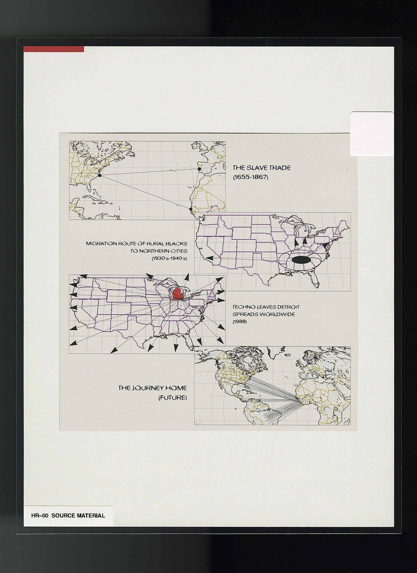
I really go based on my mood at the time. That can range anywhere from renaissance paintings, , 1920's industrial revolution posters, 1980's industrial music packaging22, early 2000’s millenium fueled futurism23… and everywhere in the middle. A lot of what I've been into lately and the eras I've been referencing—which is definitely a collective hive mind thing happening—is Detroit techno. My obsession starts when I think to myself, ‘what is the cultural catalyst that caused Detroit, and specifically black Detroit, to have such a forward thinking creative movement that spawned what we now know as techno’? I've been exploring that a lot
As I’ve gotten older, I’m also learning that some things I was made fun of for liking as a kid—for ‘not being things that black kids should be into’—actually purely started from black culture.
NR
What about the kid reading this who is trying to crack their own code—Finding their own voice through their life and material they see in the world. What advice do you have for them?
HR
You have to look inward. I did a workshop at VCU about obsession titled, ‘Sacred Objects’. I had every student bring their most prized possession to class, asked them to be introspective for a moment and ask "what does this mean to me and why?" then each student made a dedication to their object. I remember one student brought a SIM card—he explained, ‘‘they not only carry data, but also my experience and memory in different parts of the world. I see them as imprints of different cultures, values, friendships and family." For his dedication, he compiled voicemails and field recordings into a beautiful audio collage that could be in the New Museum. The workshop resonated so much with students, and for many of them, it sparked some of their favorite work. As design students, many of them were taught not to be personal at all—that design is merely a service. But if a client is hiring you for your point of view, don’t you need one first?
If I’m in the creative industry, then I want to create. I don't want to be a factory. I can’t be one. I don't think any true artist’s brain can do that. I want to spawn, seed, grow, prune. I want to ferment and let the petri dish spiral out of control.
Everything I do is hyper-personal. It's processed through this brain, these eyes, these ears, out of this mouth, and with these hands [makes a side joke that falls flat]. It’s happening through the filter of my own lived experience; one that's very rich. I've been through a lot of difficult, traumatic, and very hard times, but I’ve also been fortunate to have really beautiful things happen in my life. It's all seen from my lens, and my experiences are what shapes that lens. I pour my heart into my work. I have to be extremely picky with who gets to receive that. That’s not to be self-serving; I'm not aiming to put the focus on me at all times. But if I make something that doesn't look like it came from my heart, then I don't want to show it.
